
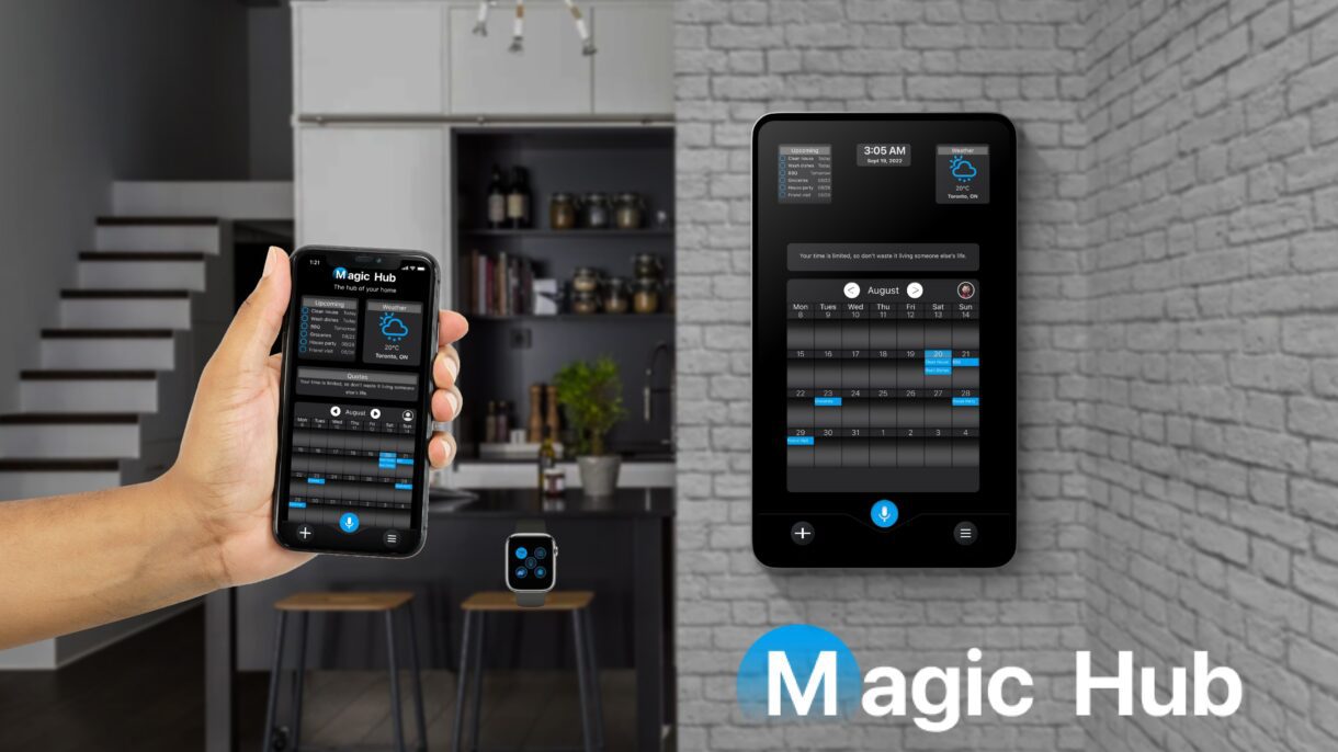
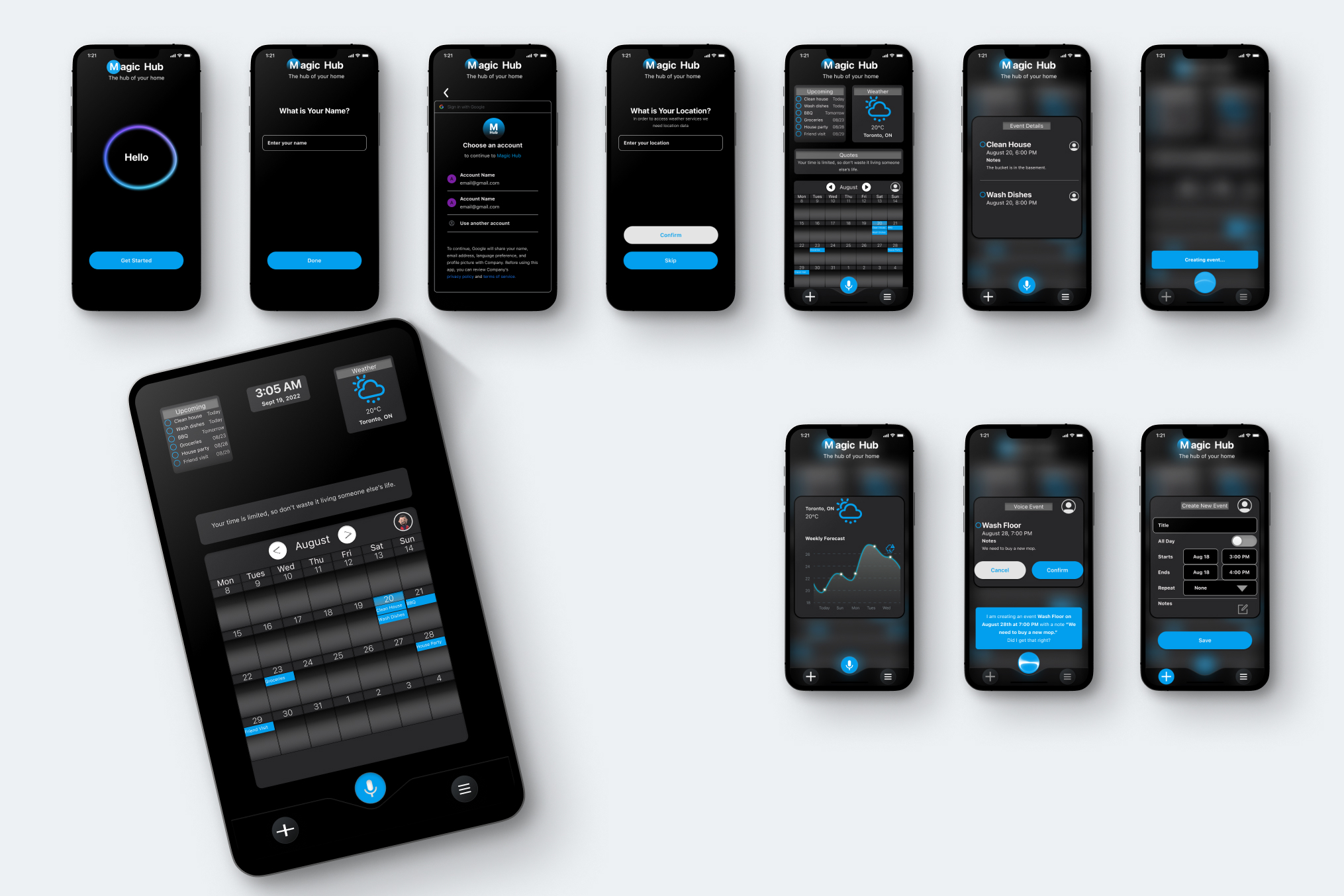
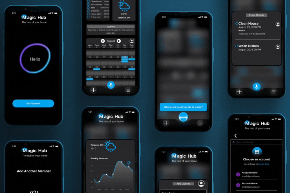
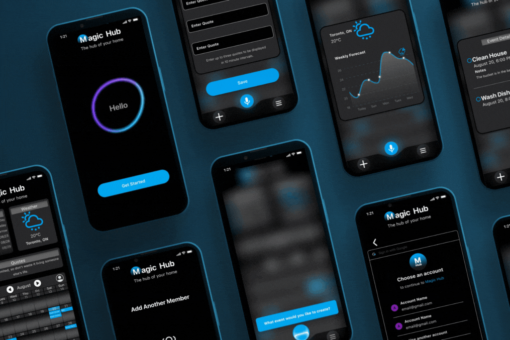
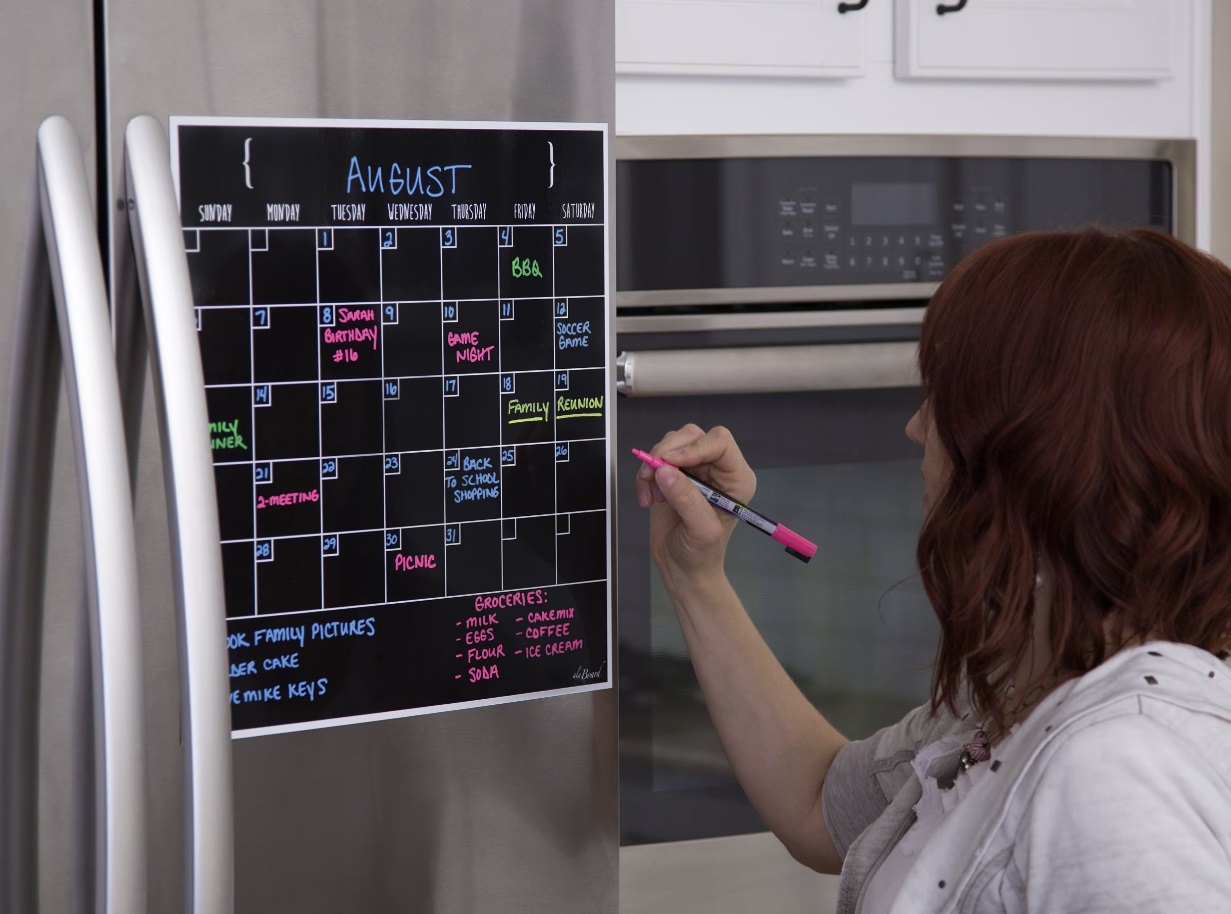
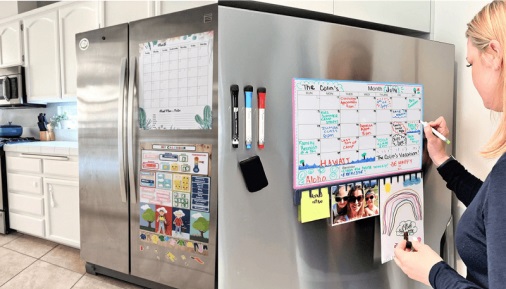
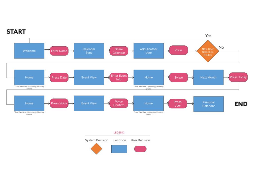
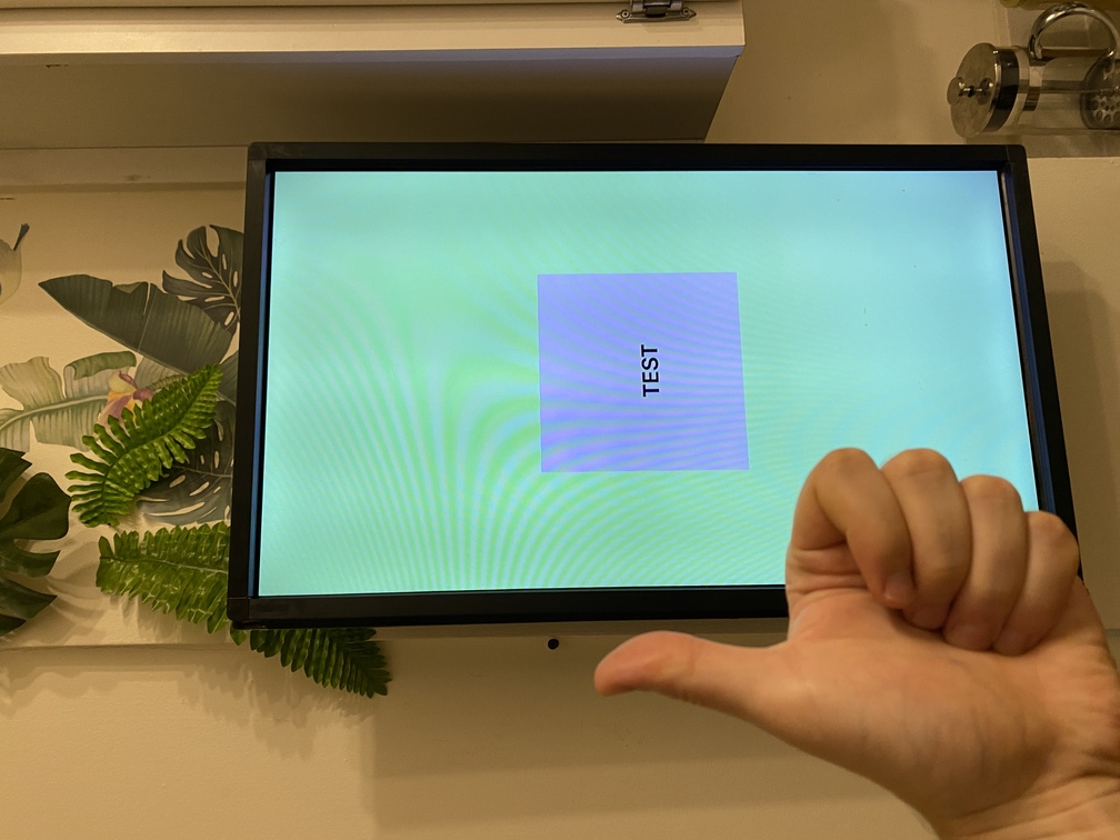
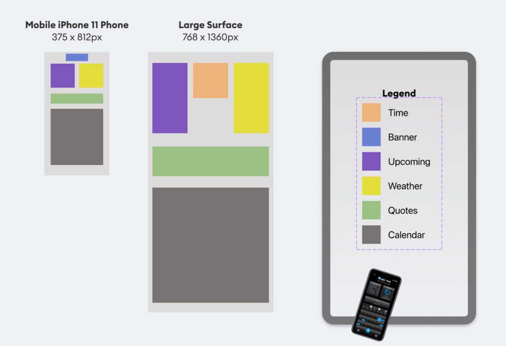
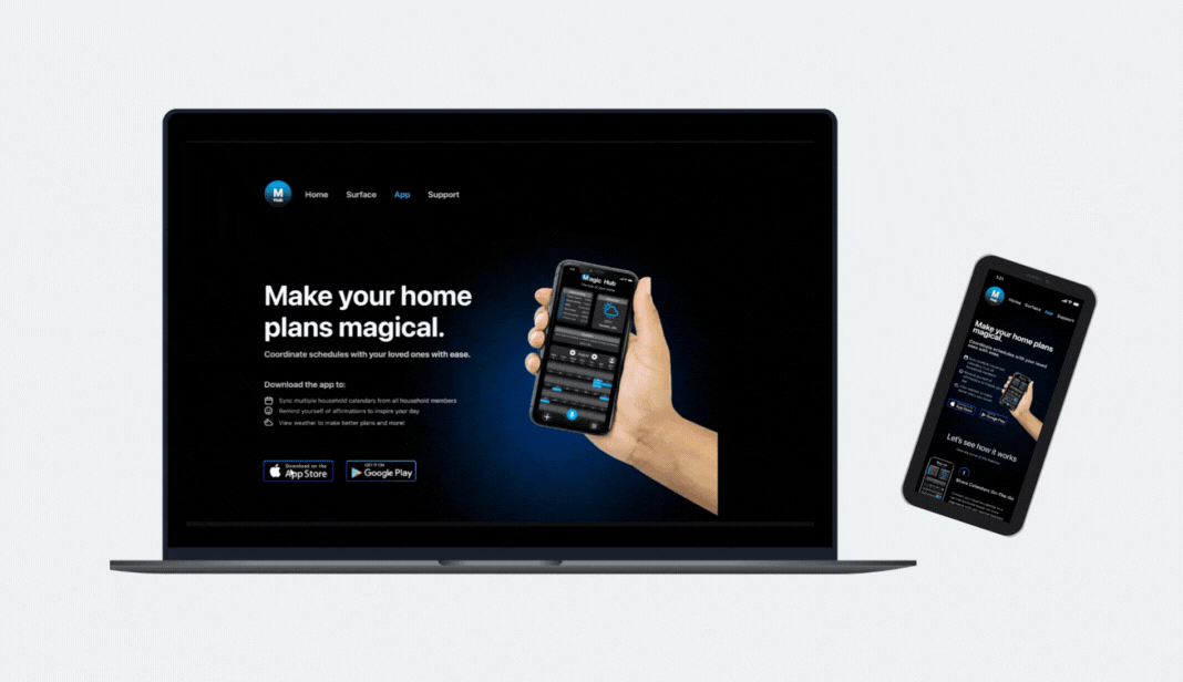
Magic Hub Interactive Display with Mobile App.
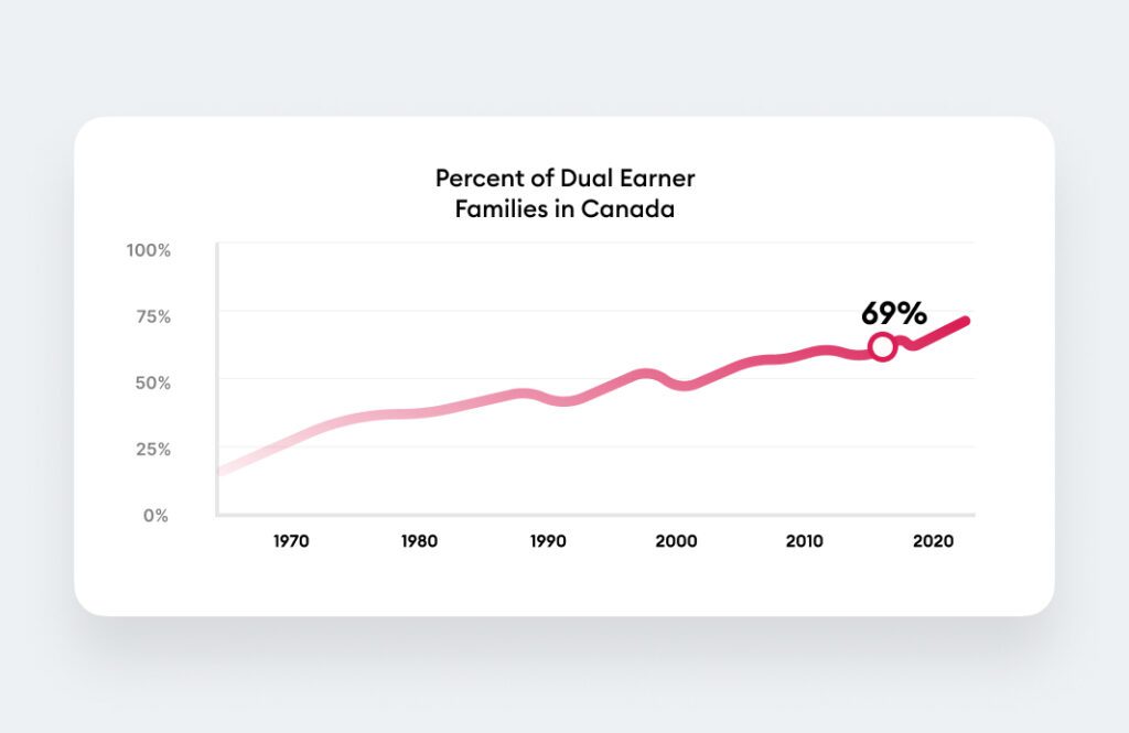
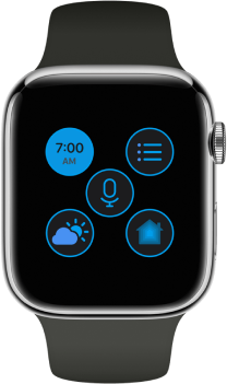
Magic Hub is a functioning interactive home display with supported mobile app and a iOS watch that improves household coordination.
- Client BrainStation Project
- Timeline 2 Months
- Skills Figma, Miro, InVision, CSS, Javascript


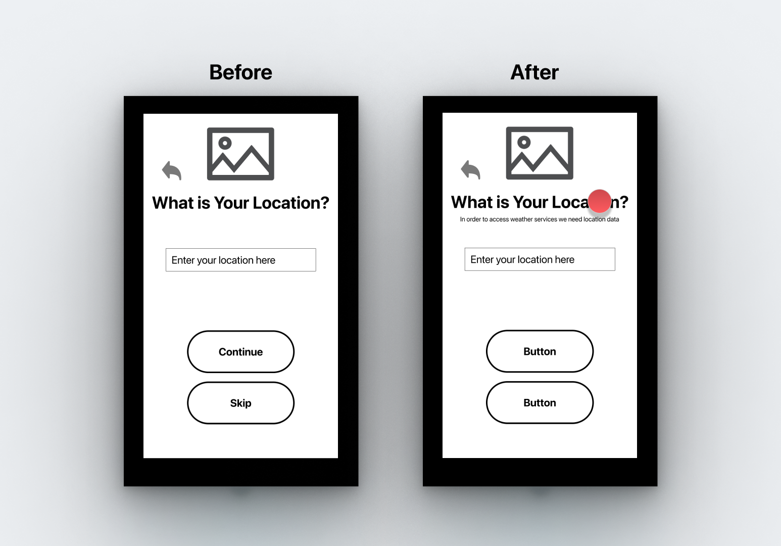
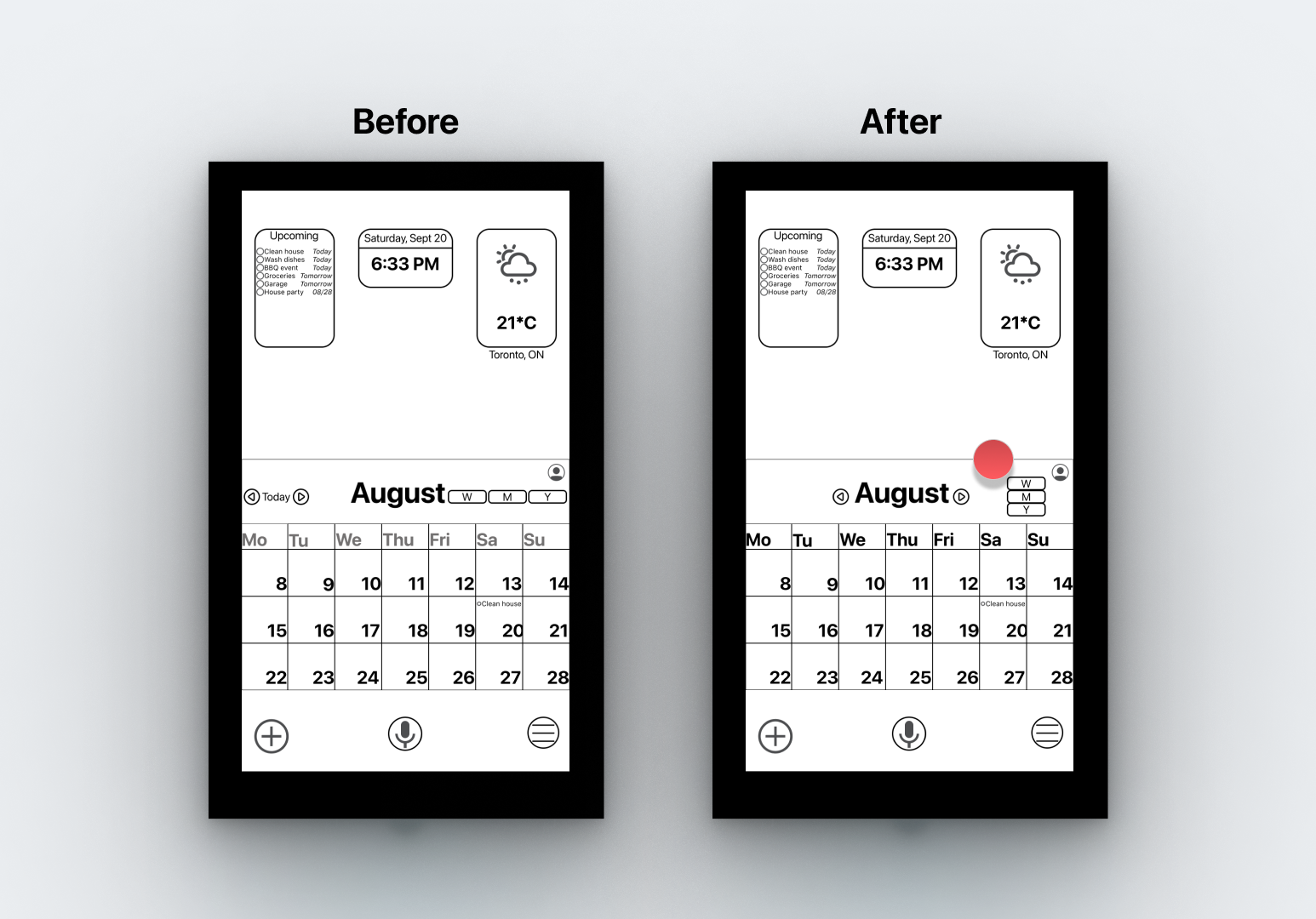
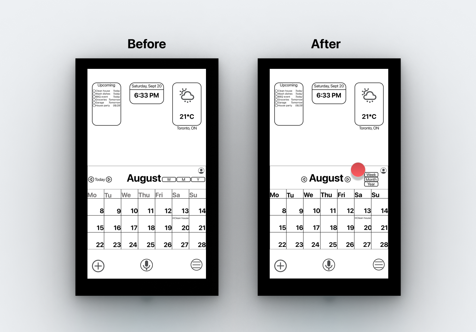
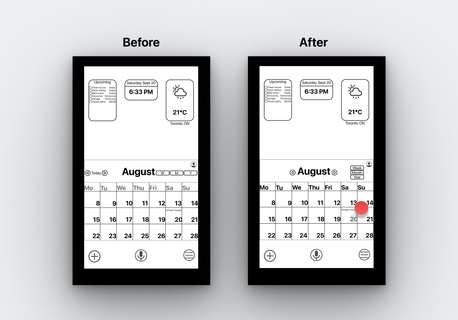
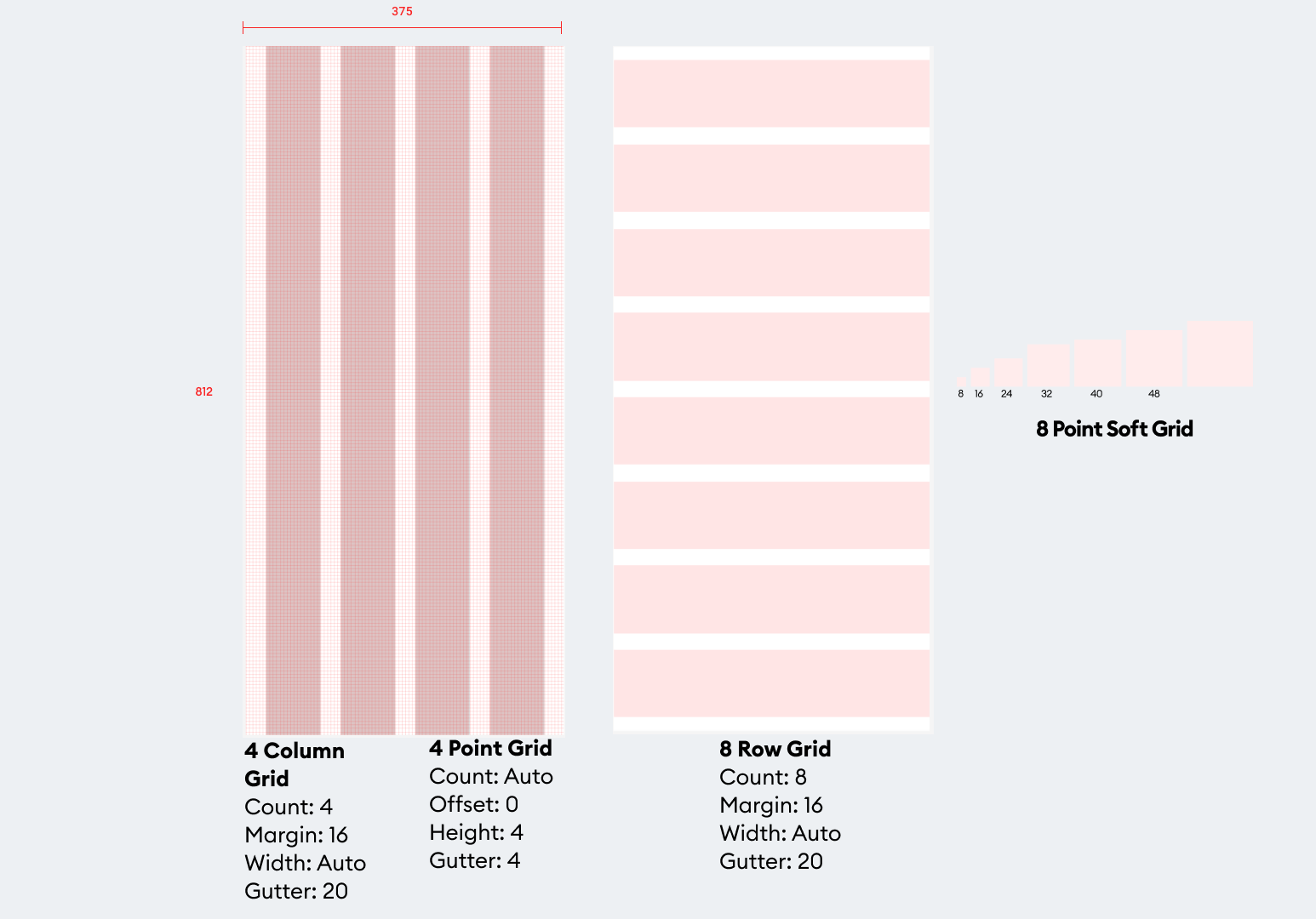
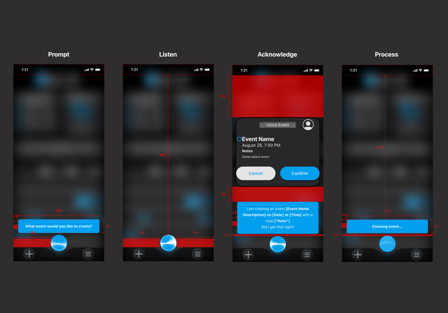
Using InVision
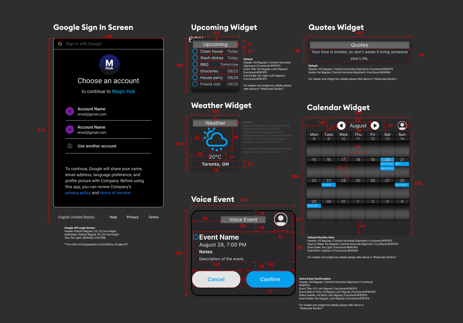
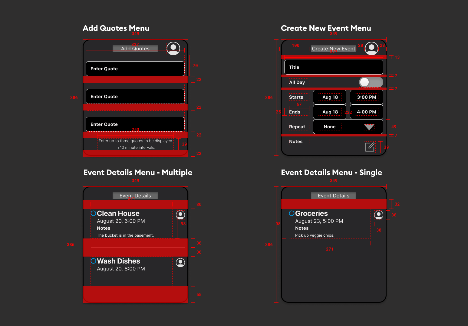
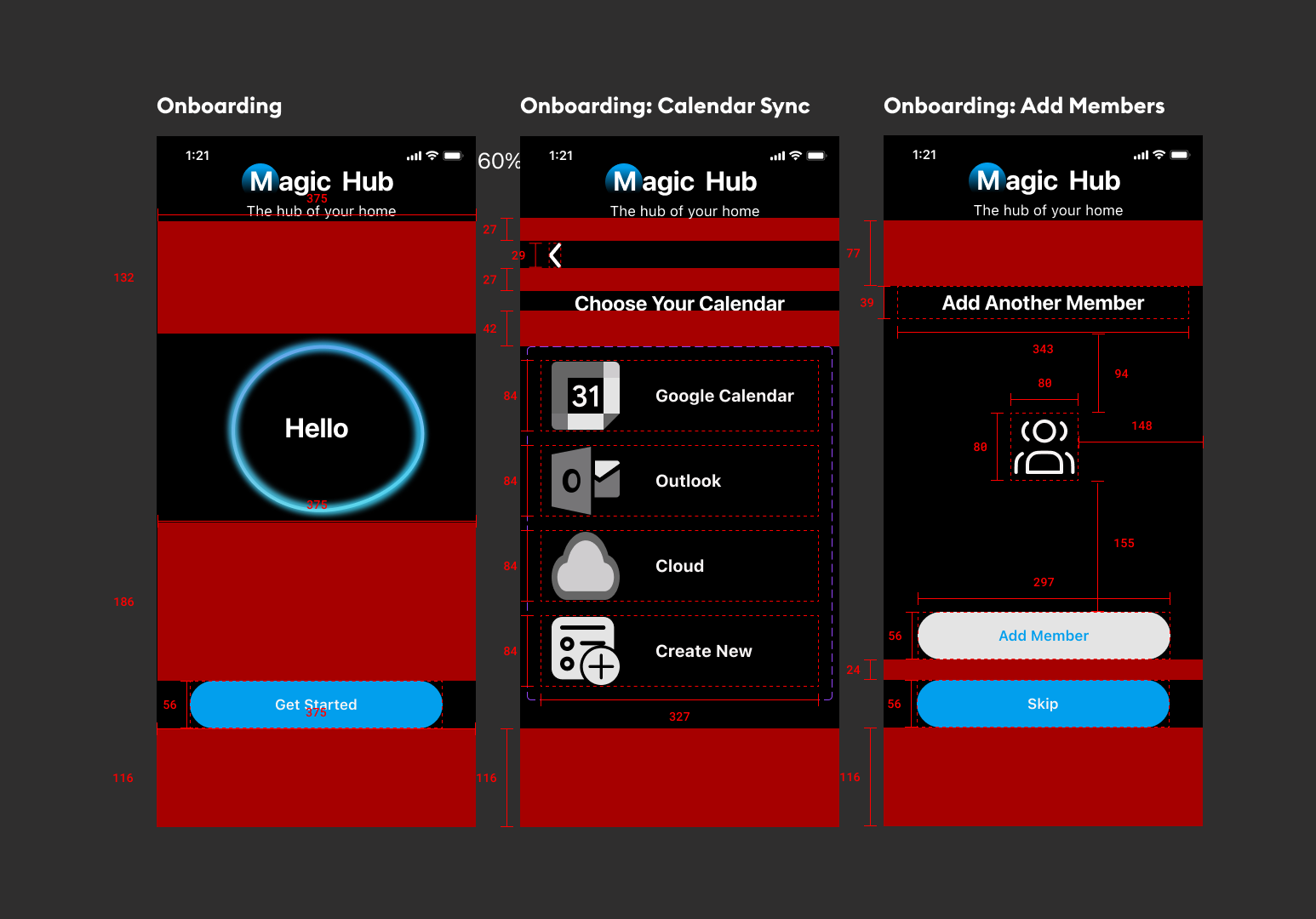
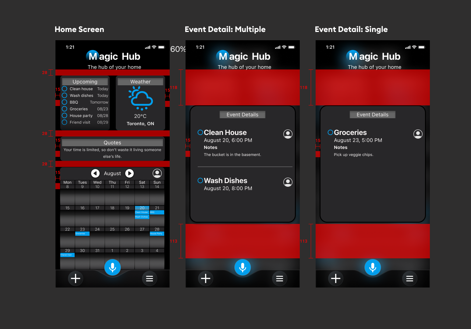
Cards
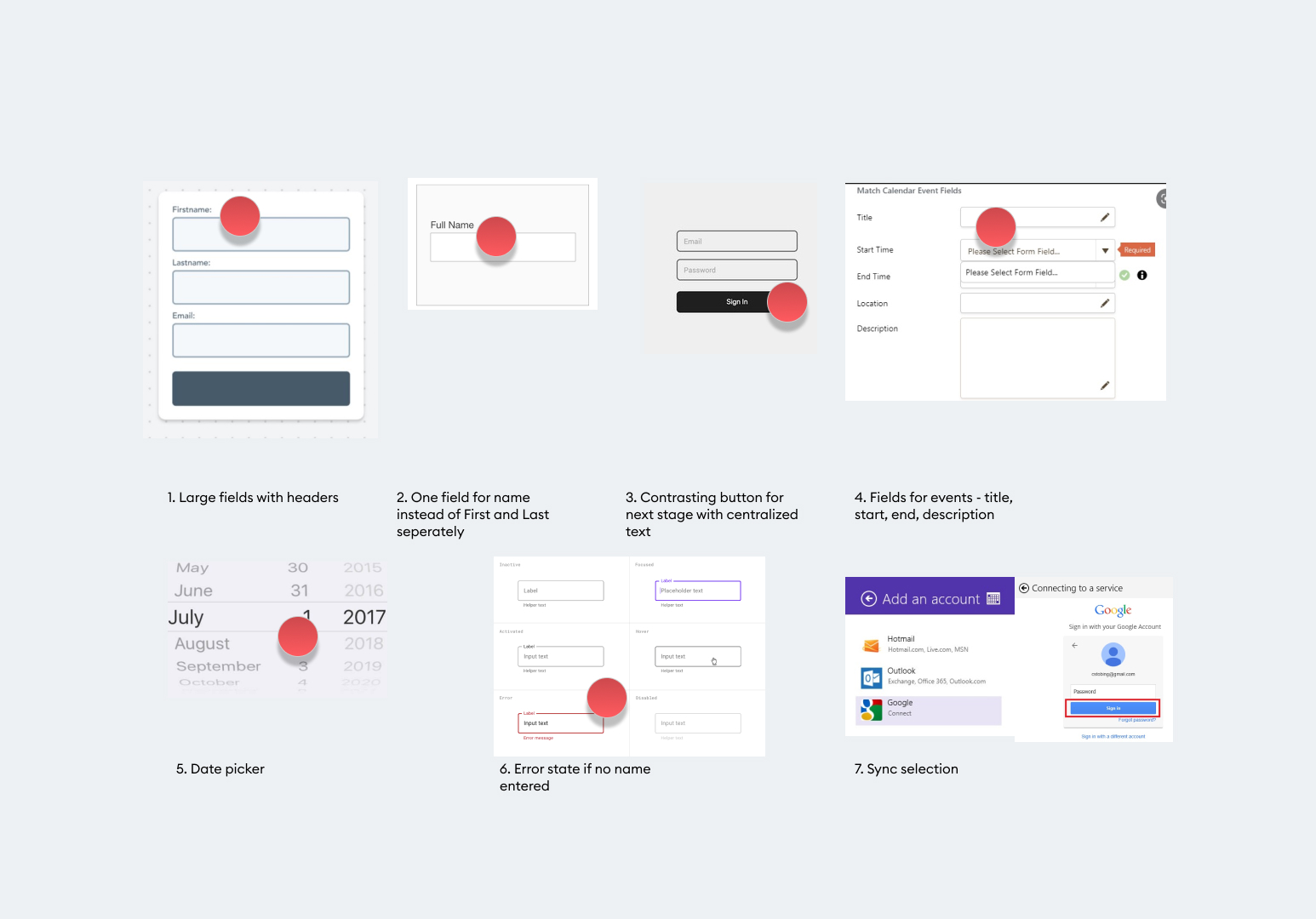
Form Fields
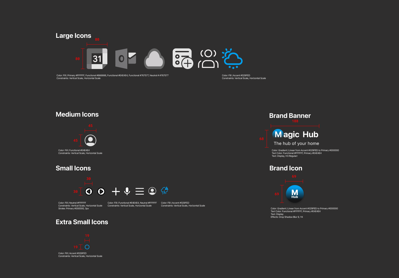
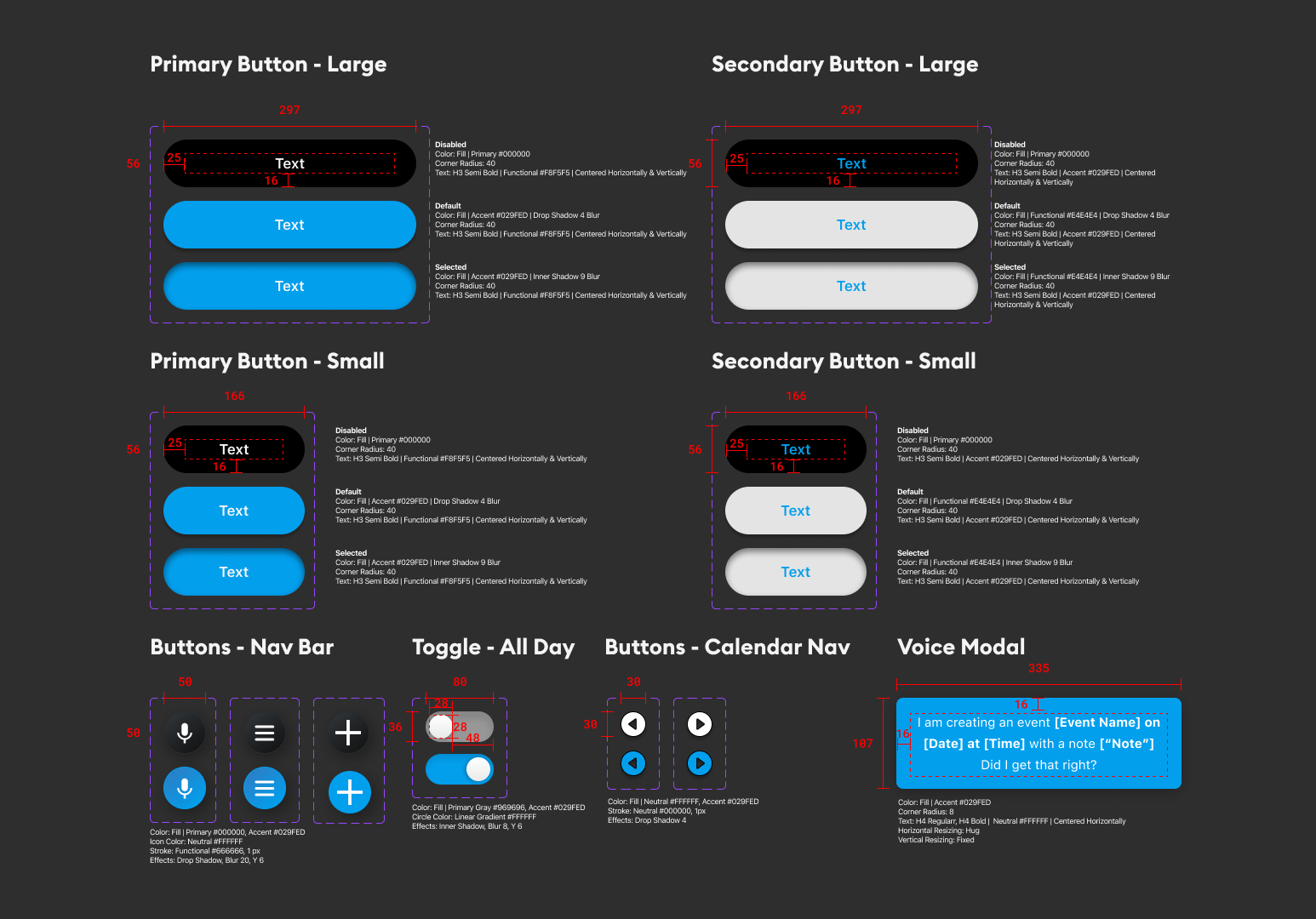
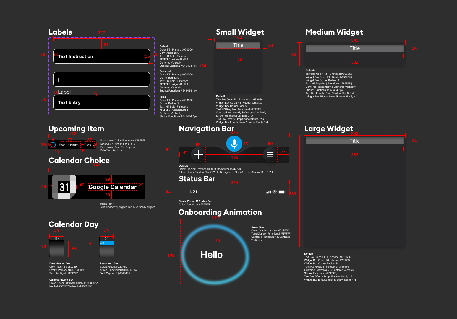
Icons, Navigation, and More
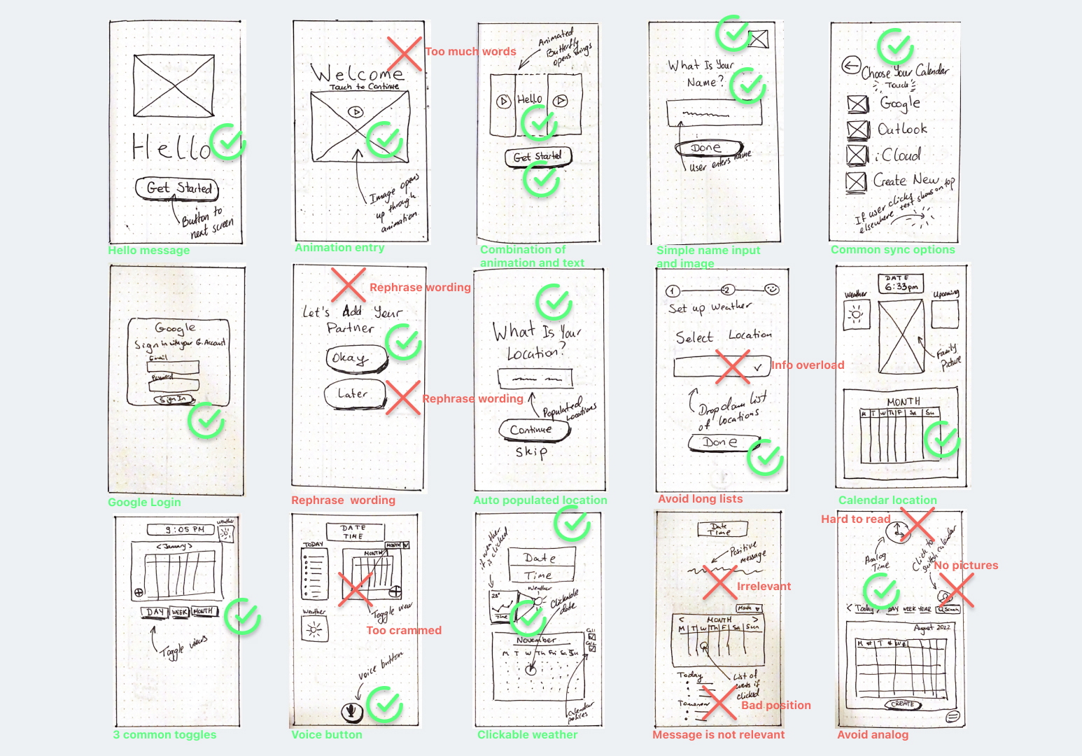
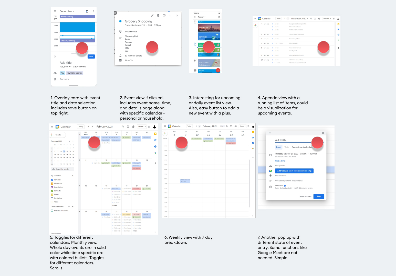
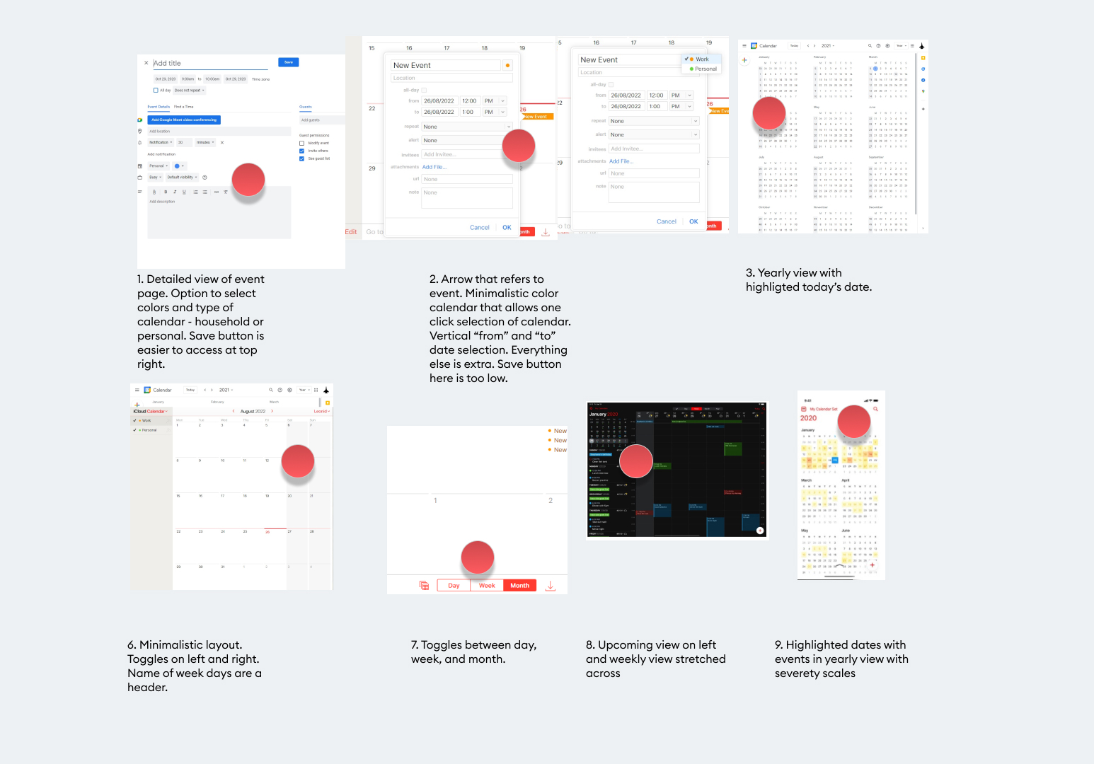
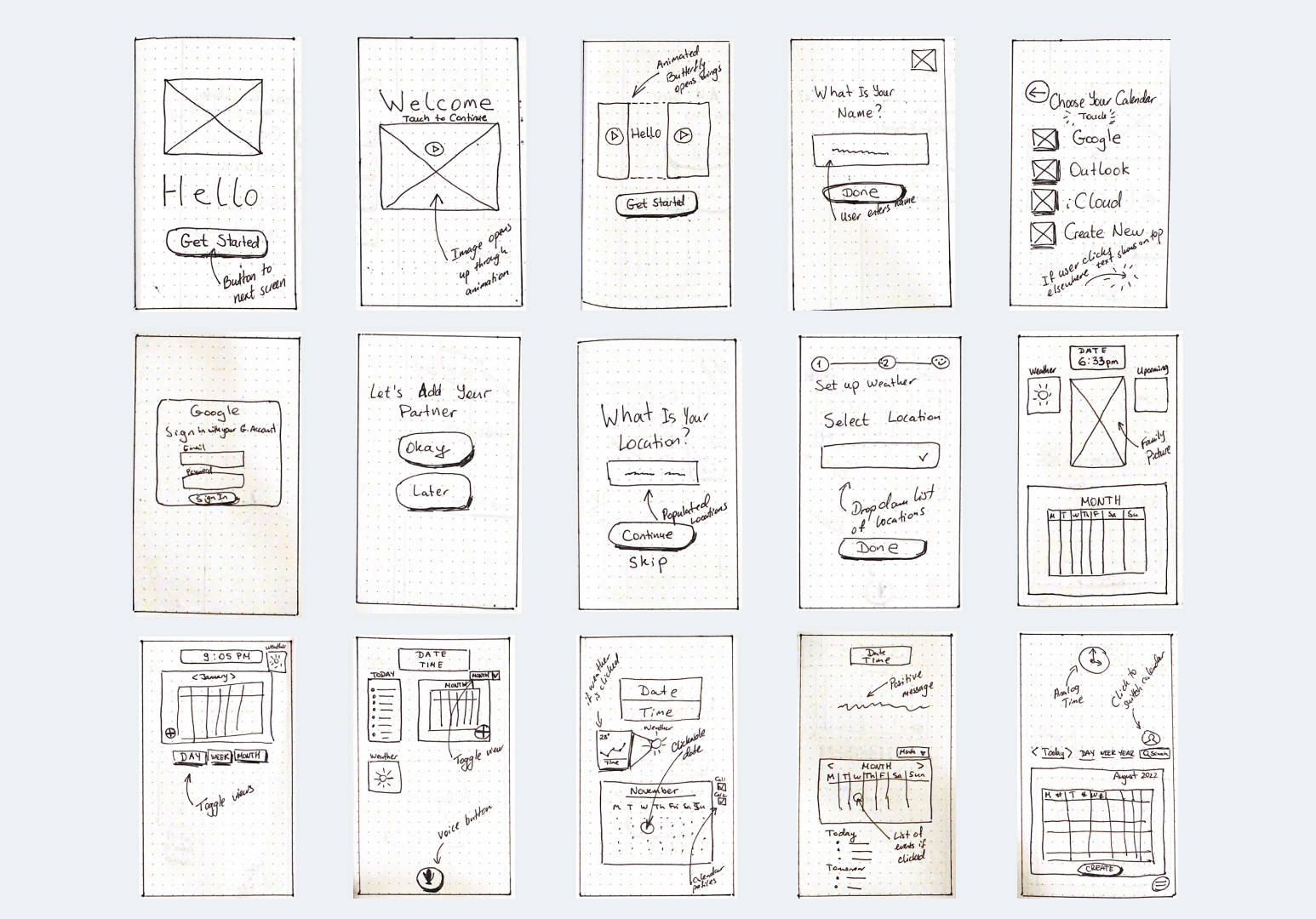
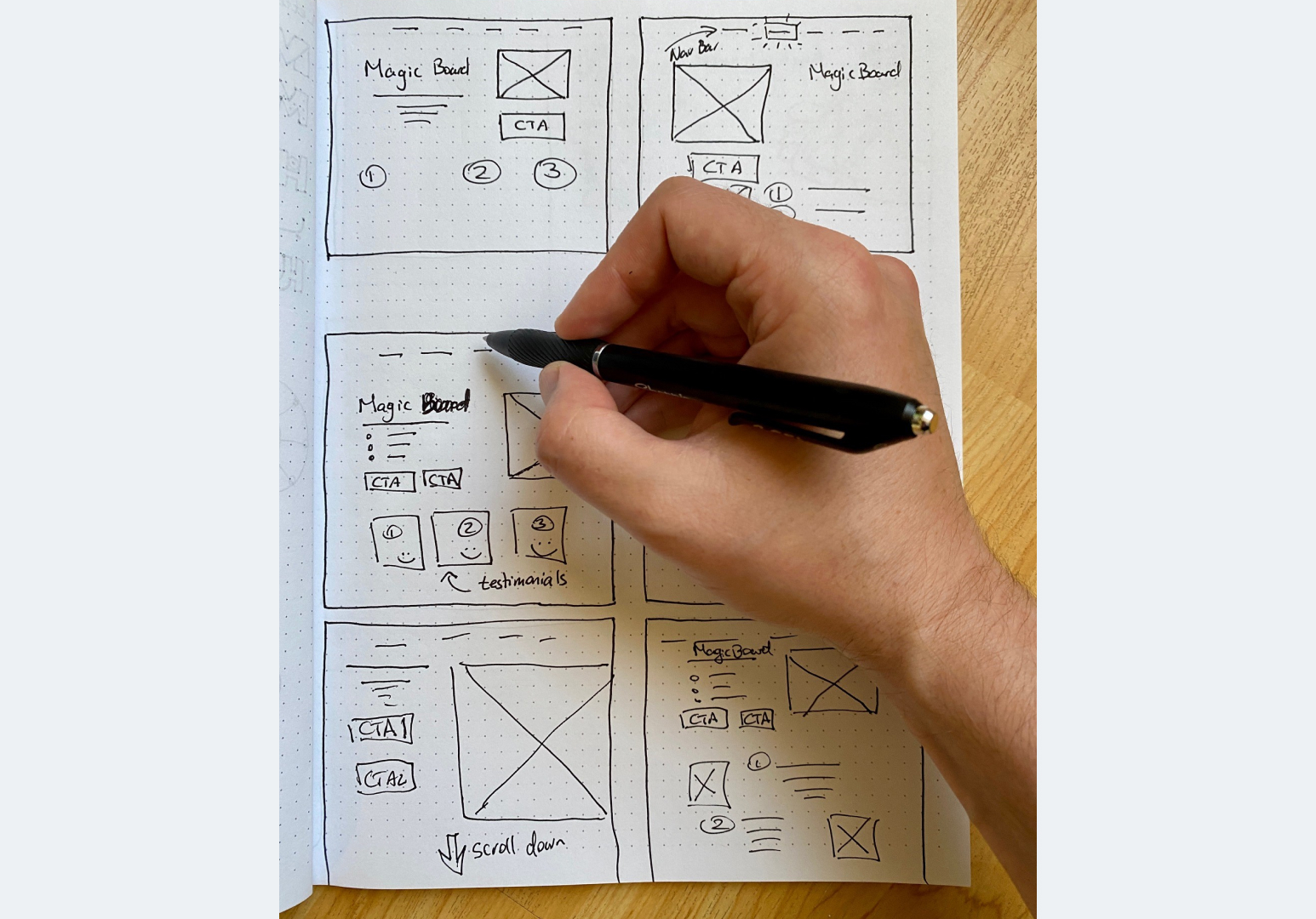
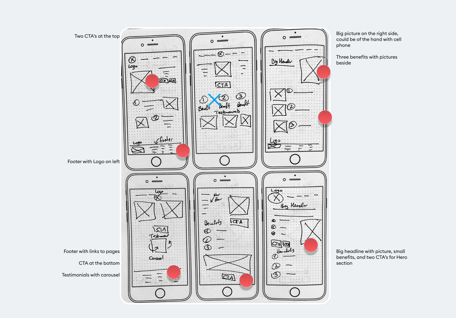
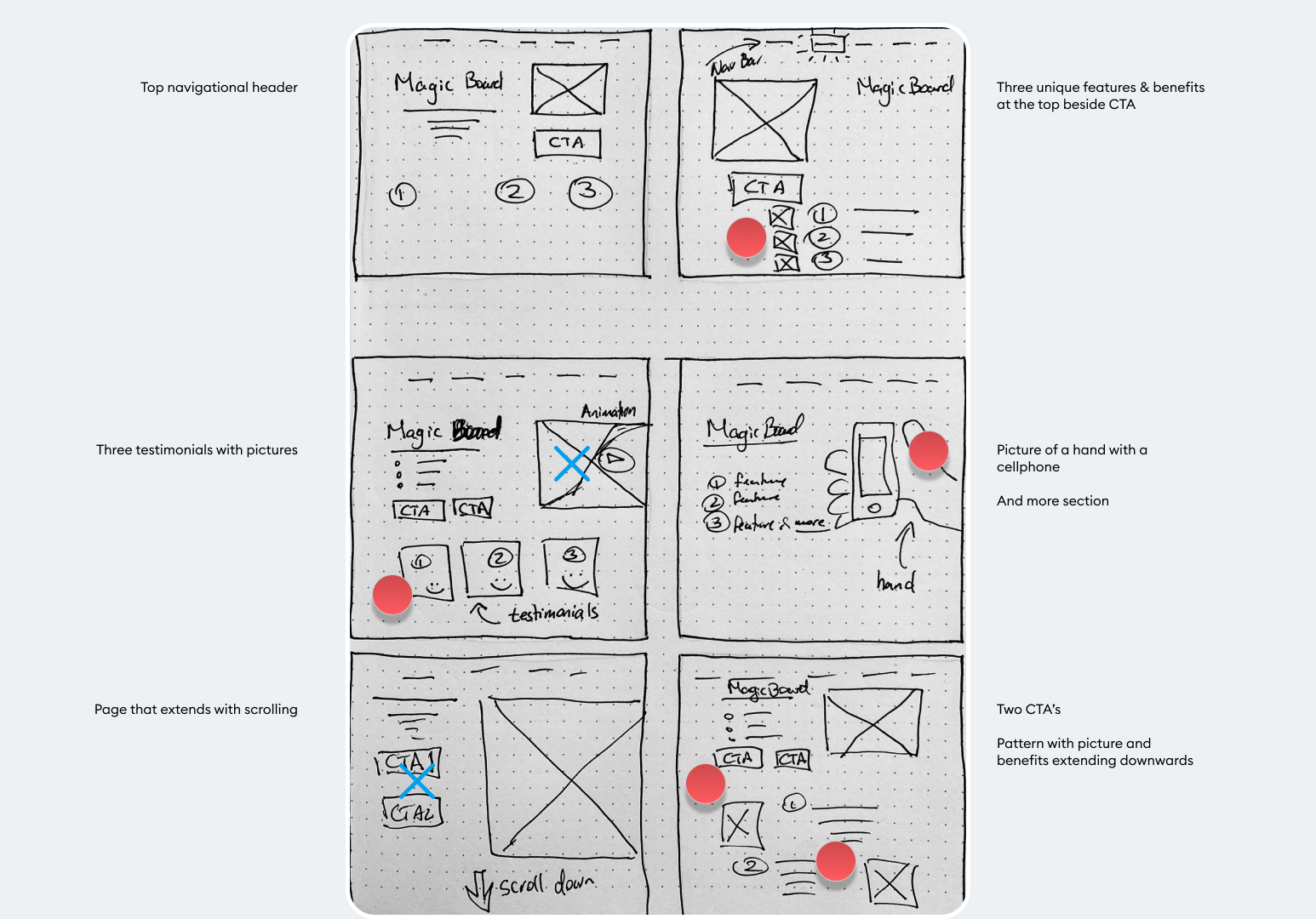
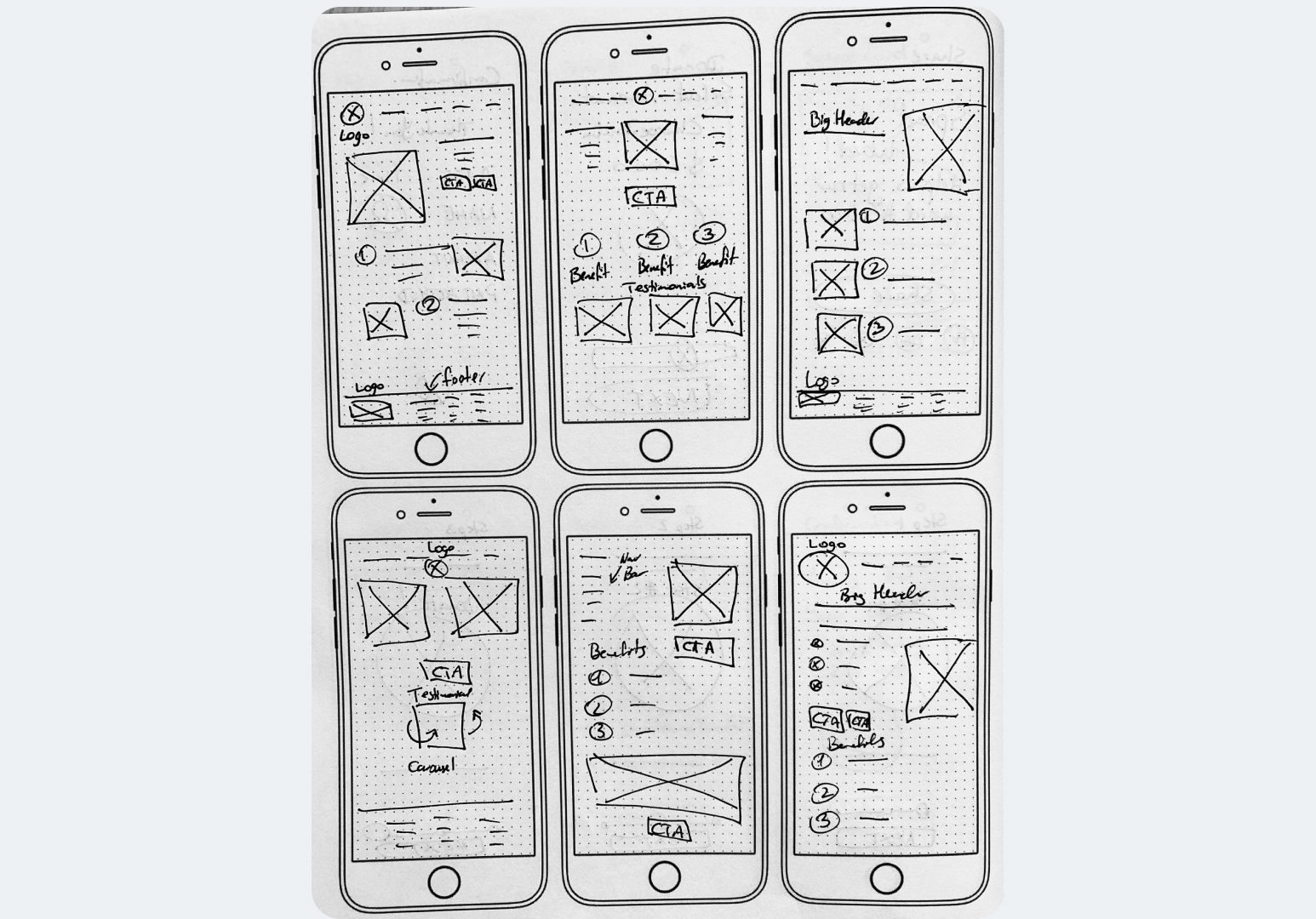
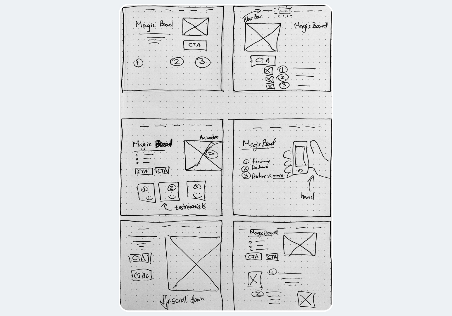
Divergence Sketches
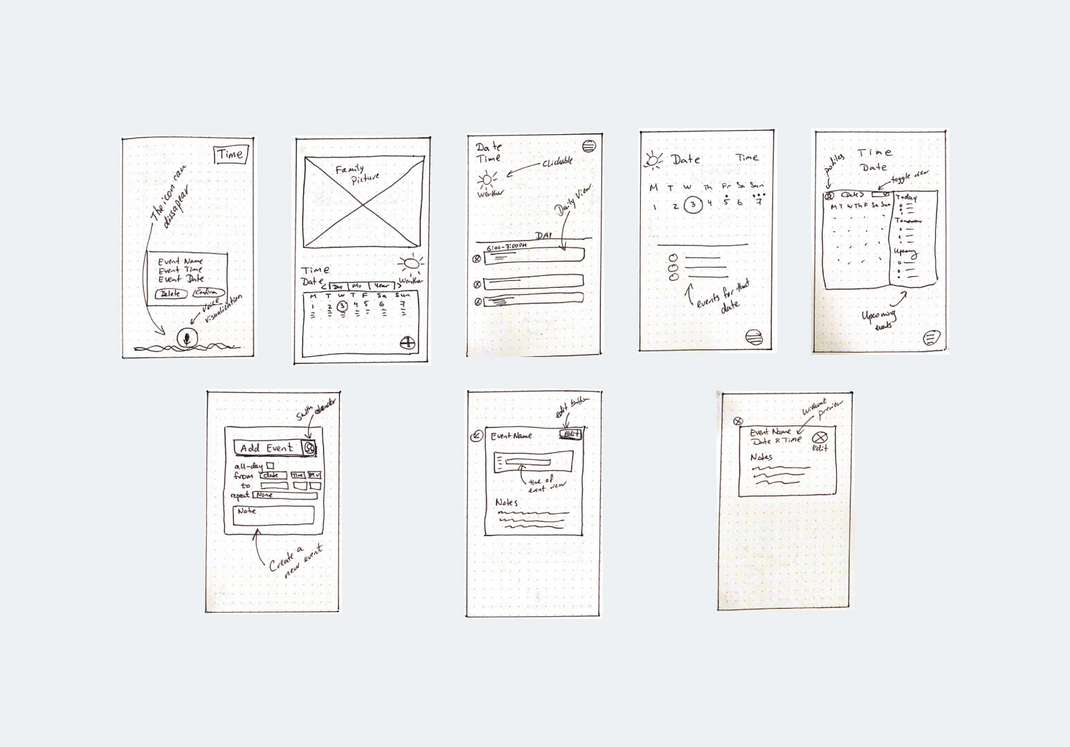
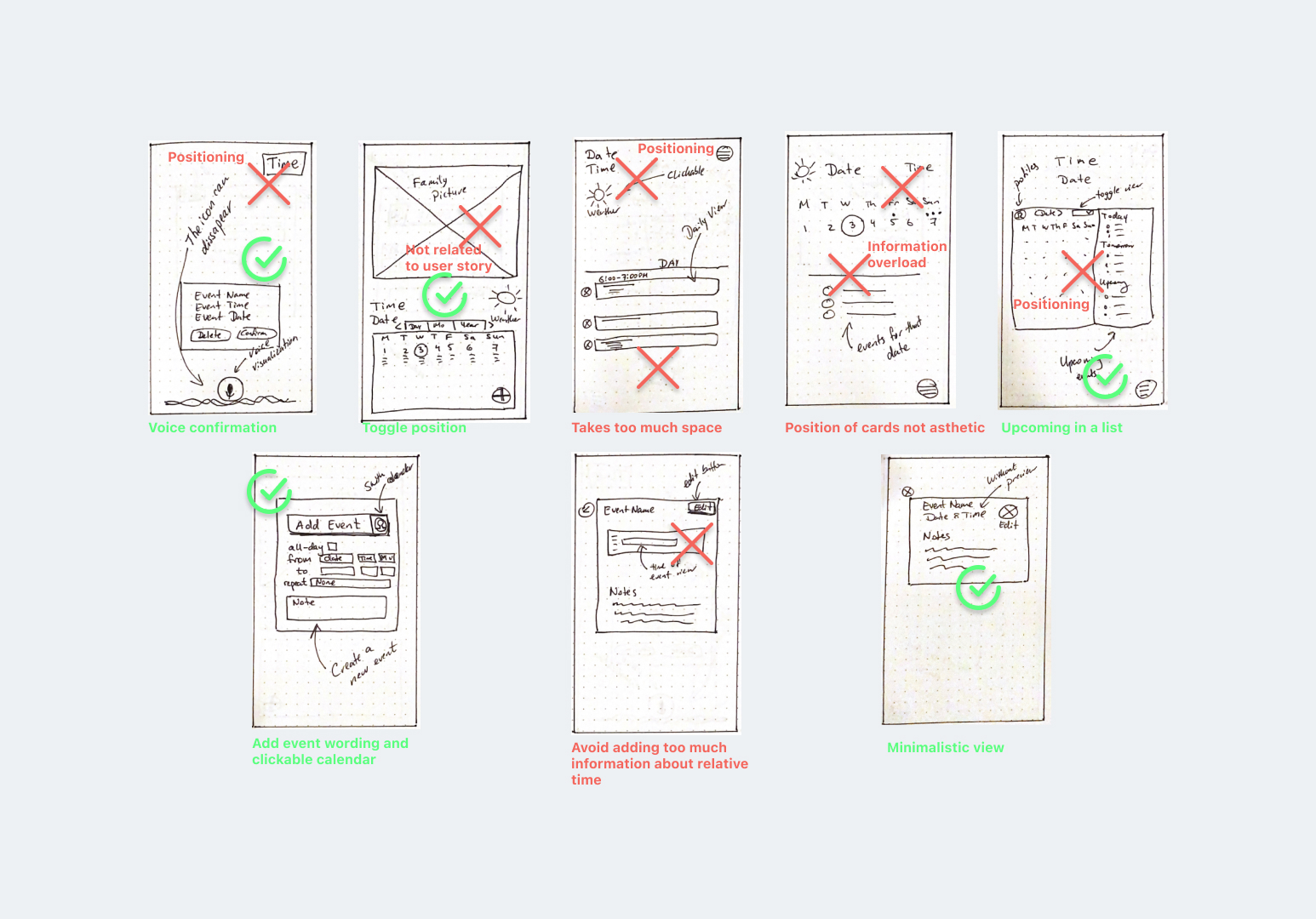
Convergence Sketches
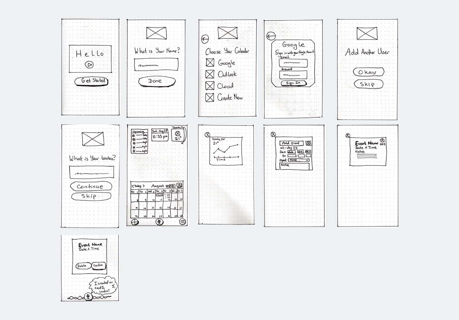
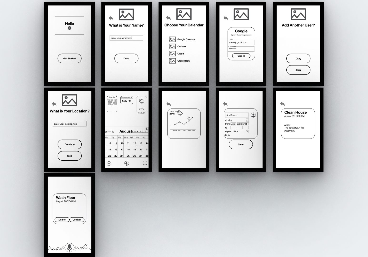
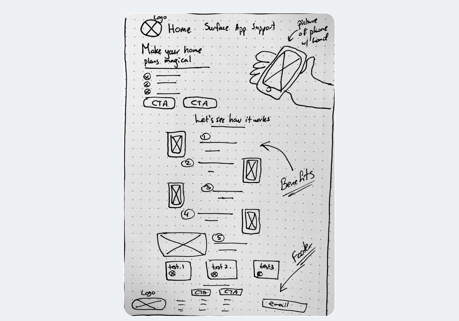
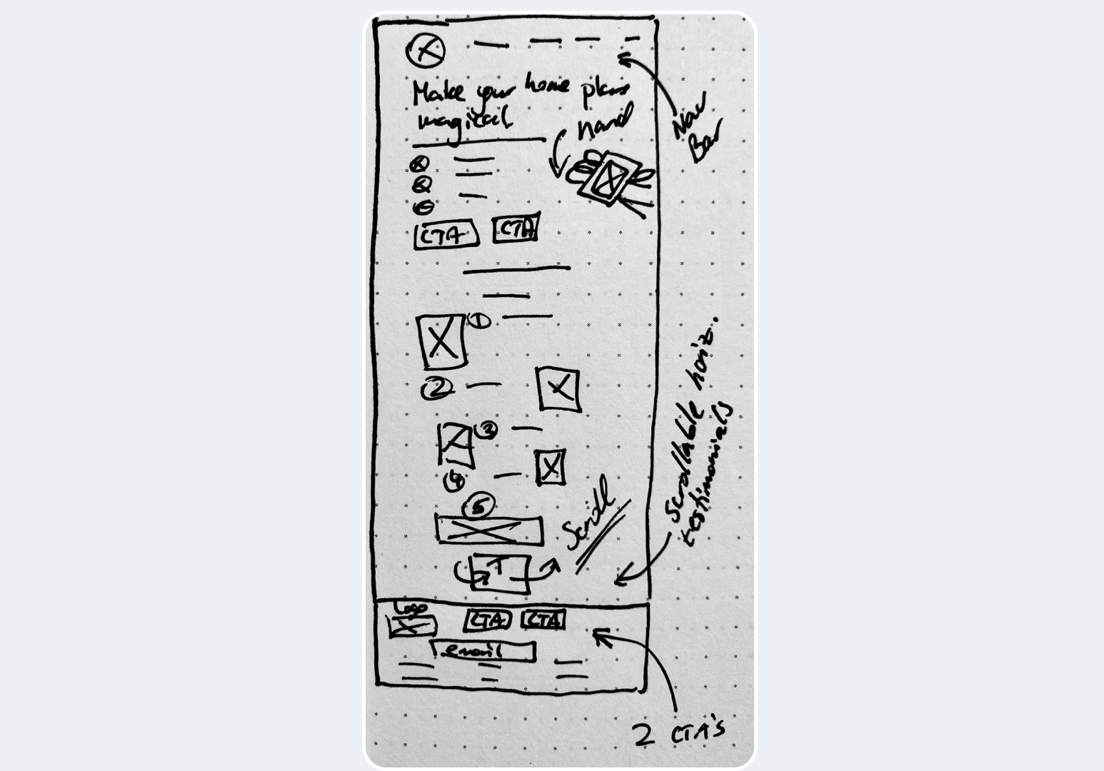
Final Sketches
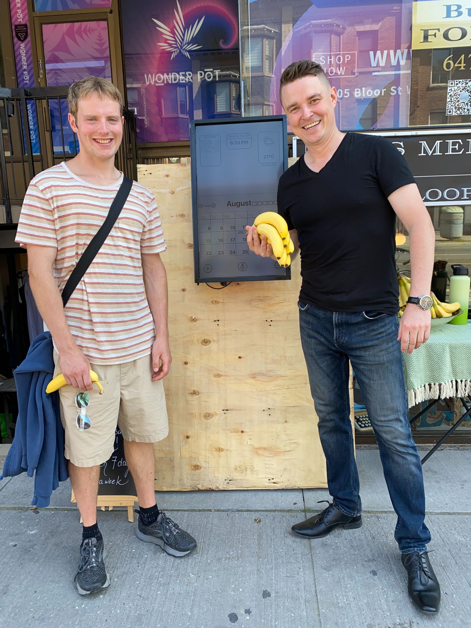
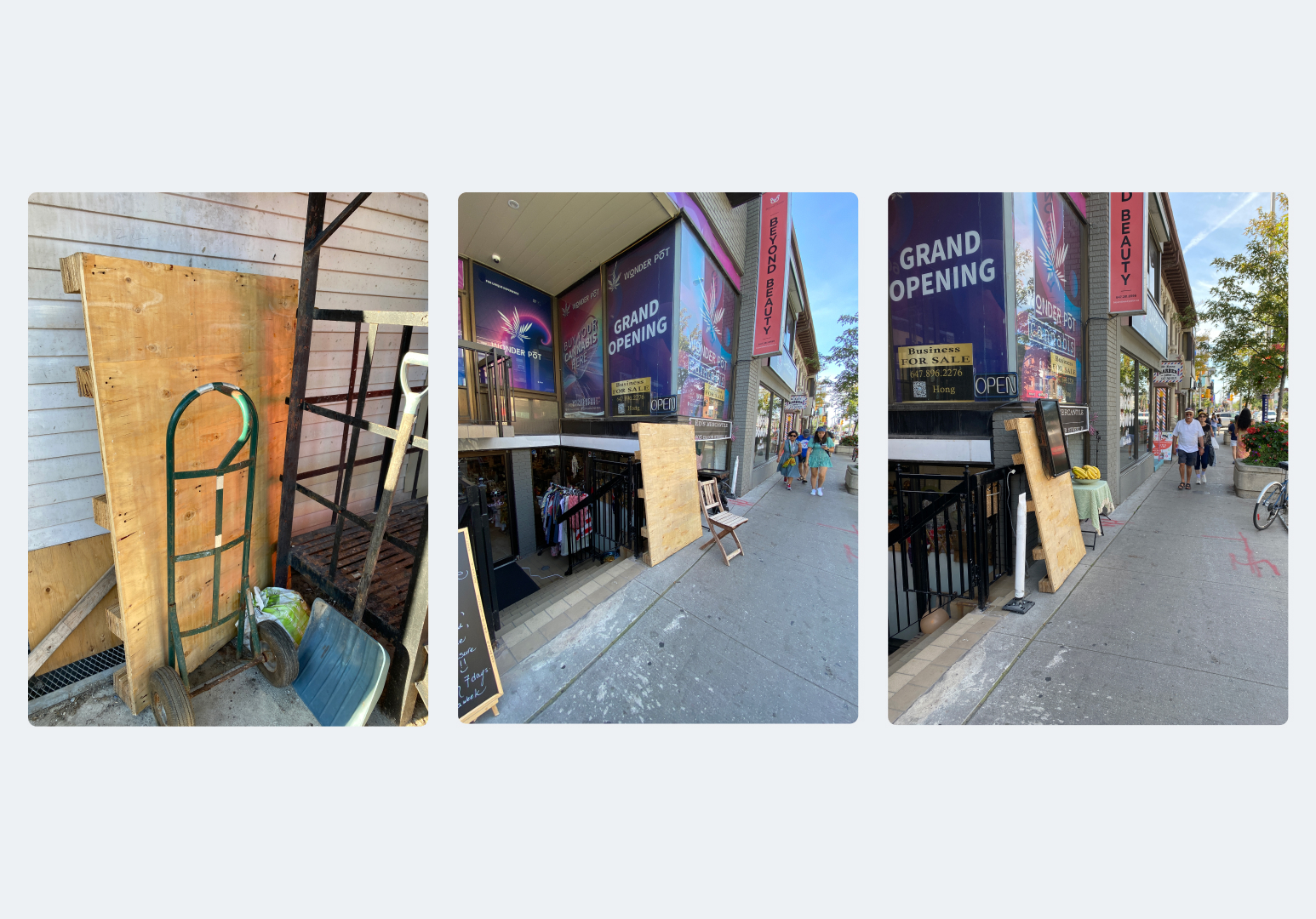
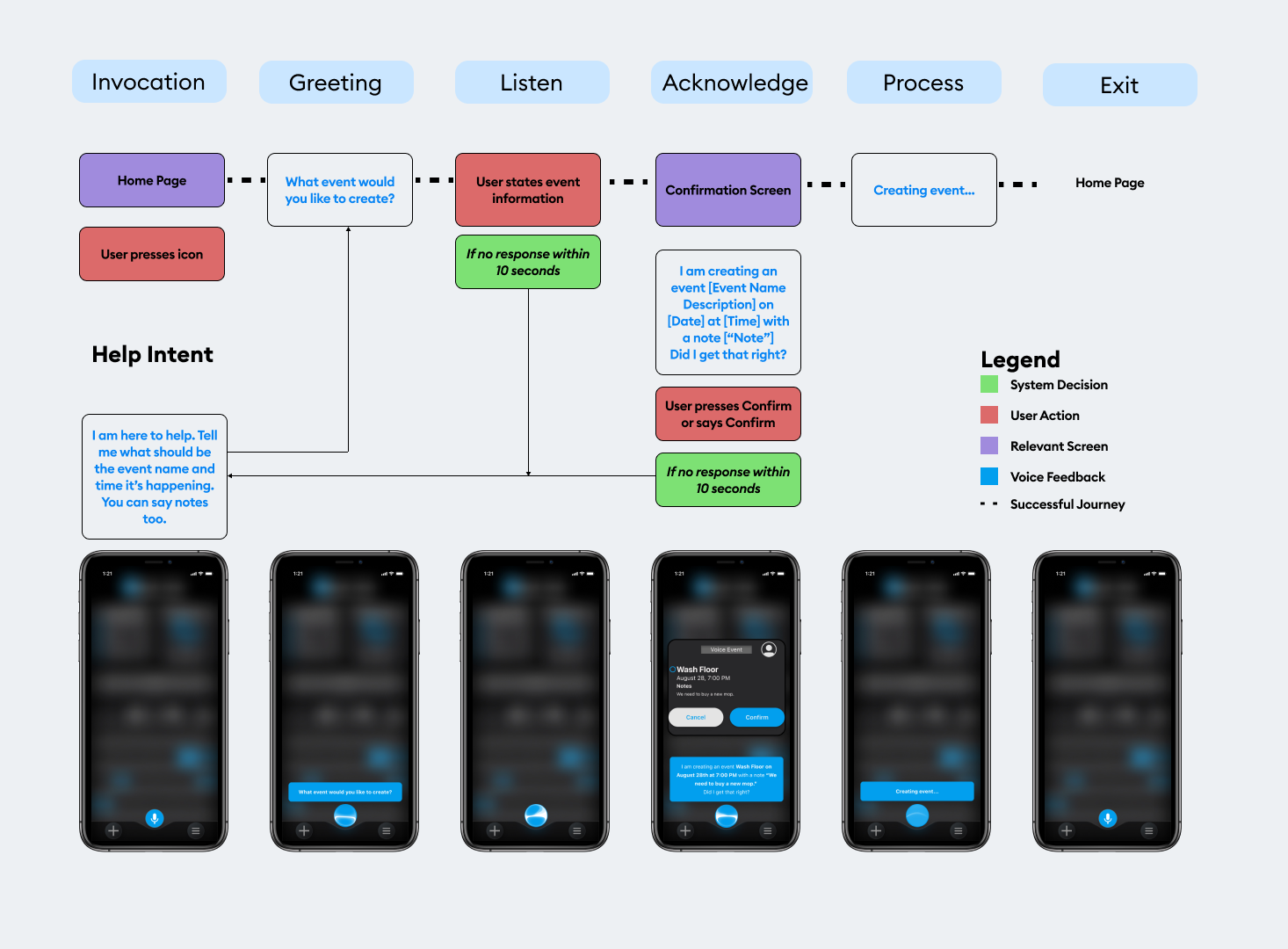
An Unexpected Opportunity
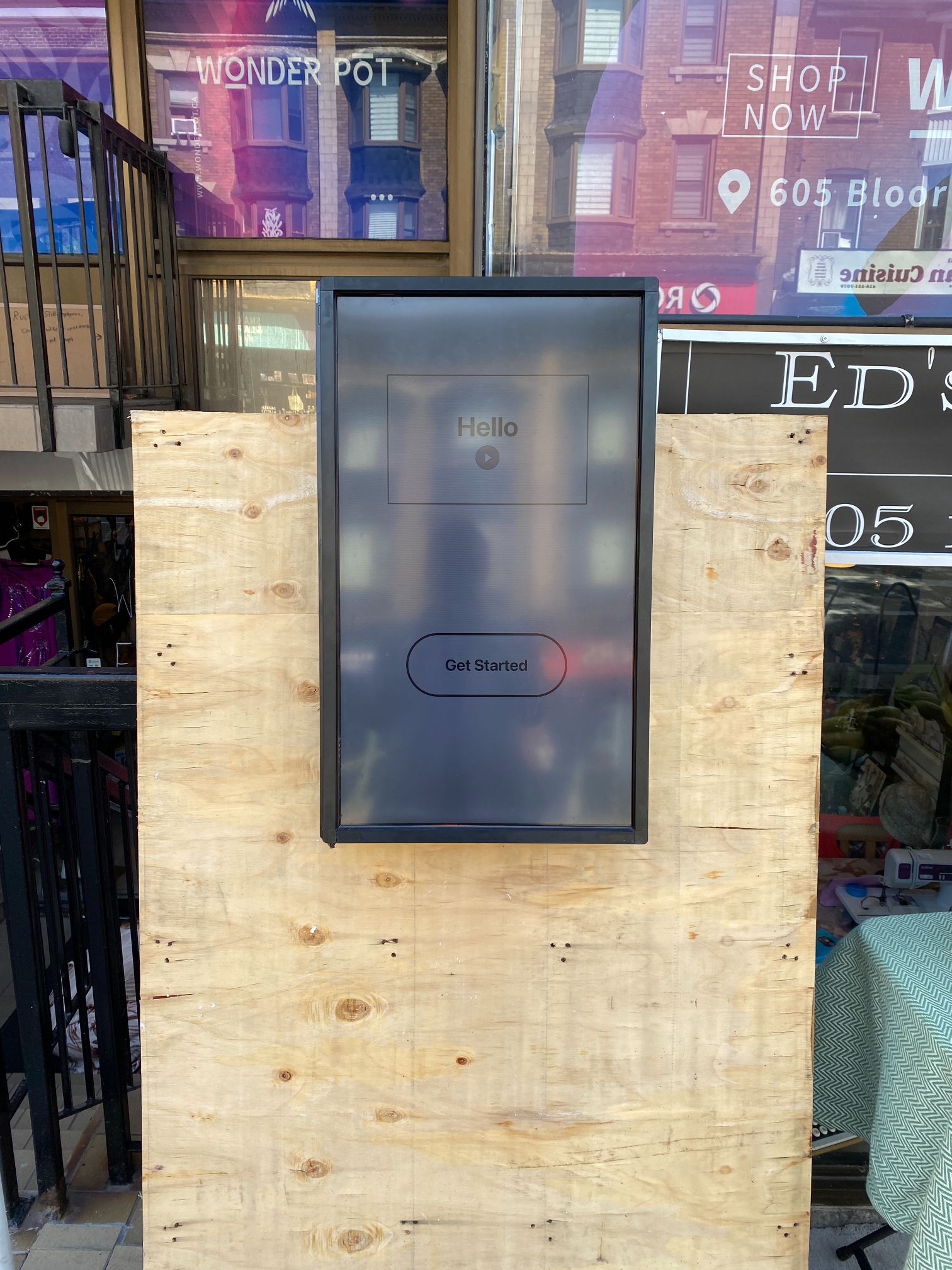
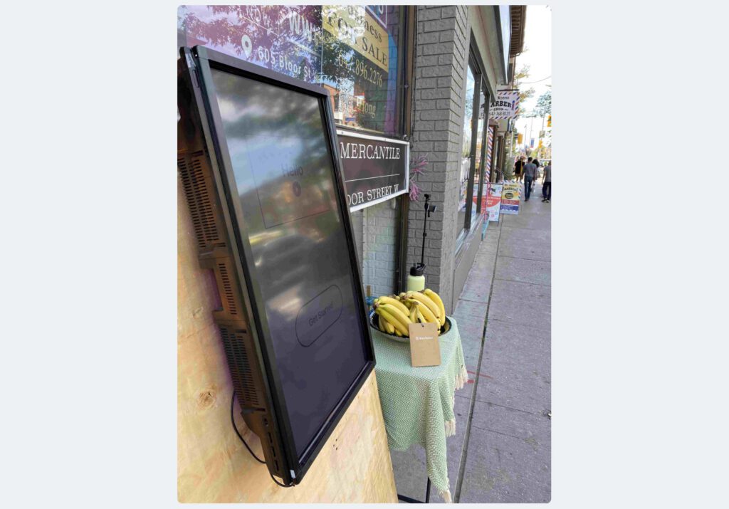
Set Up
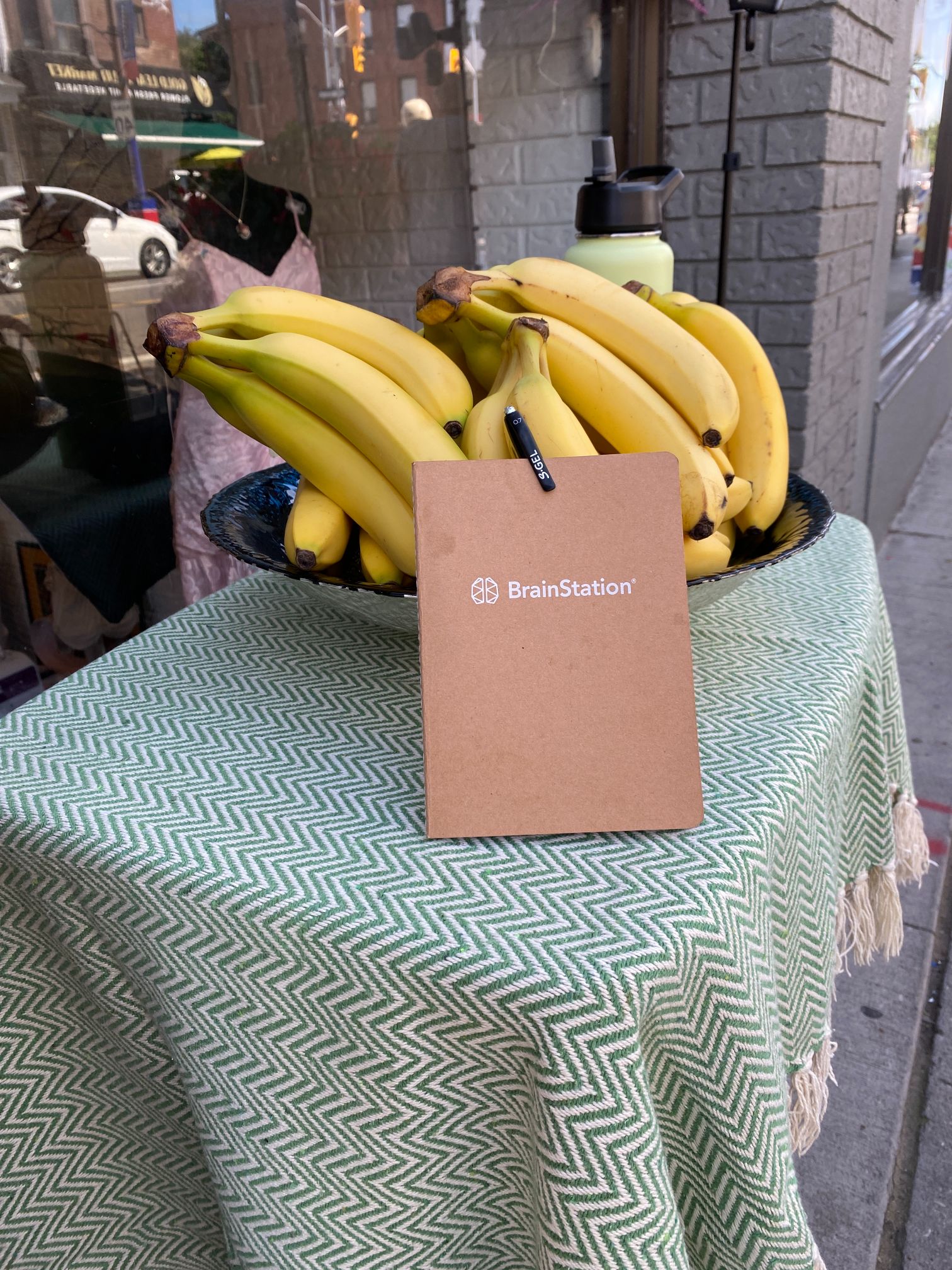
Rewards
Interview Script

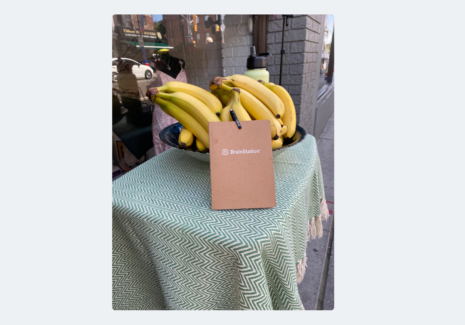
Recruiting Participants 🎥
Bonus: Marketing Campaign! 🎥
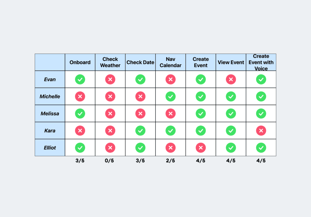
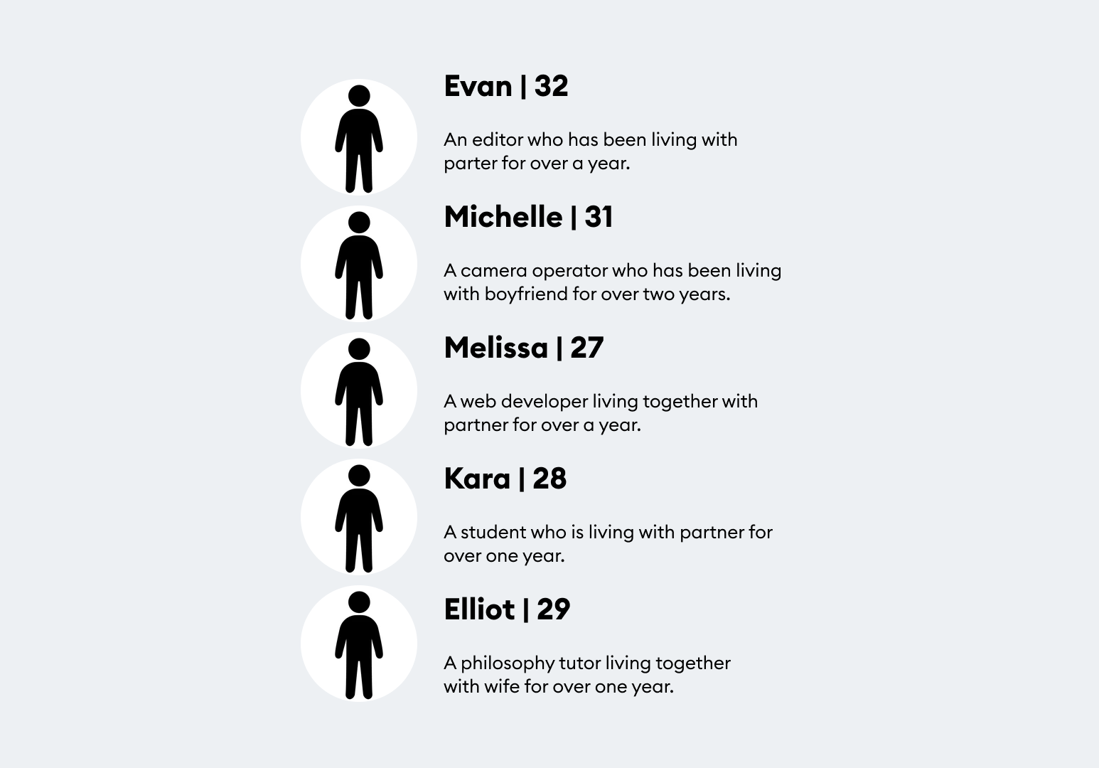
User Test Participants
User Test Results

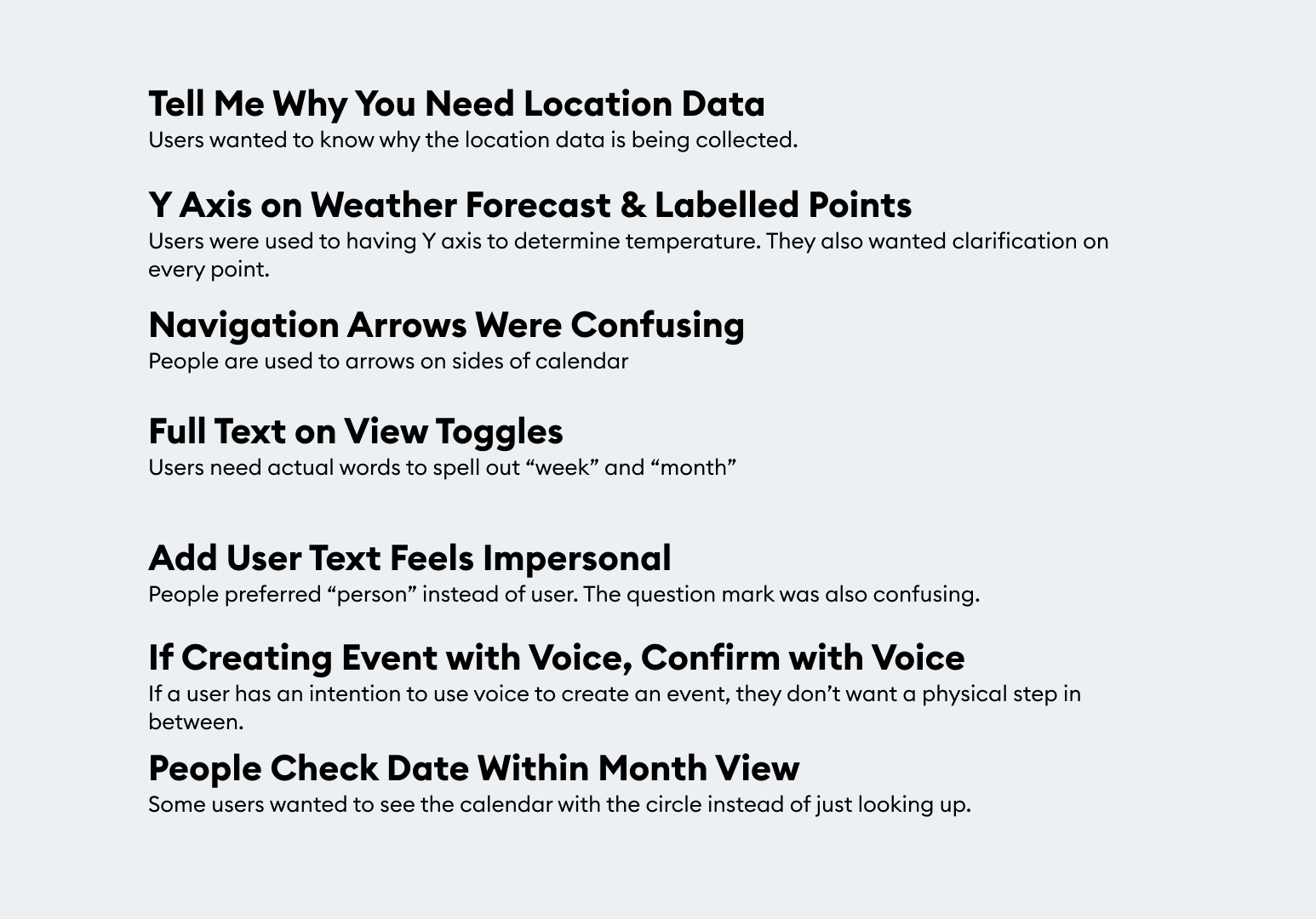
Overall Task Analysis
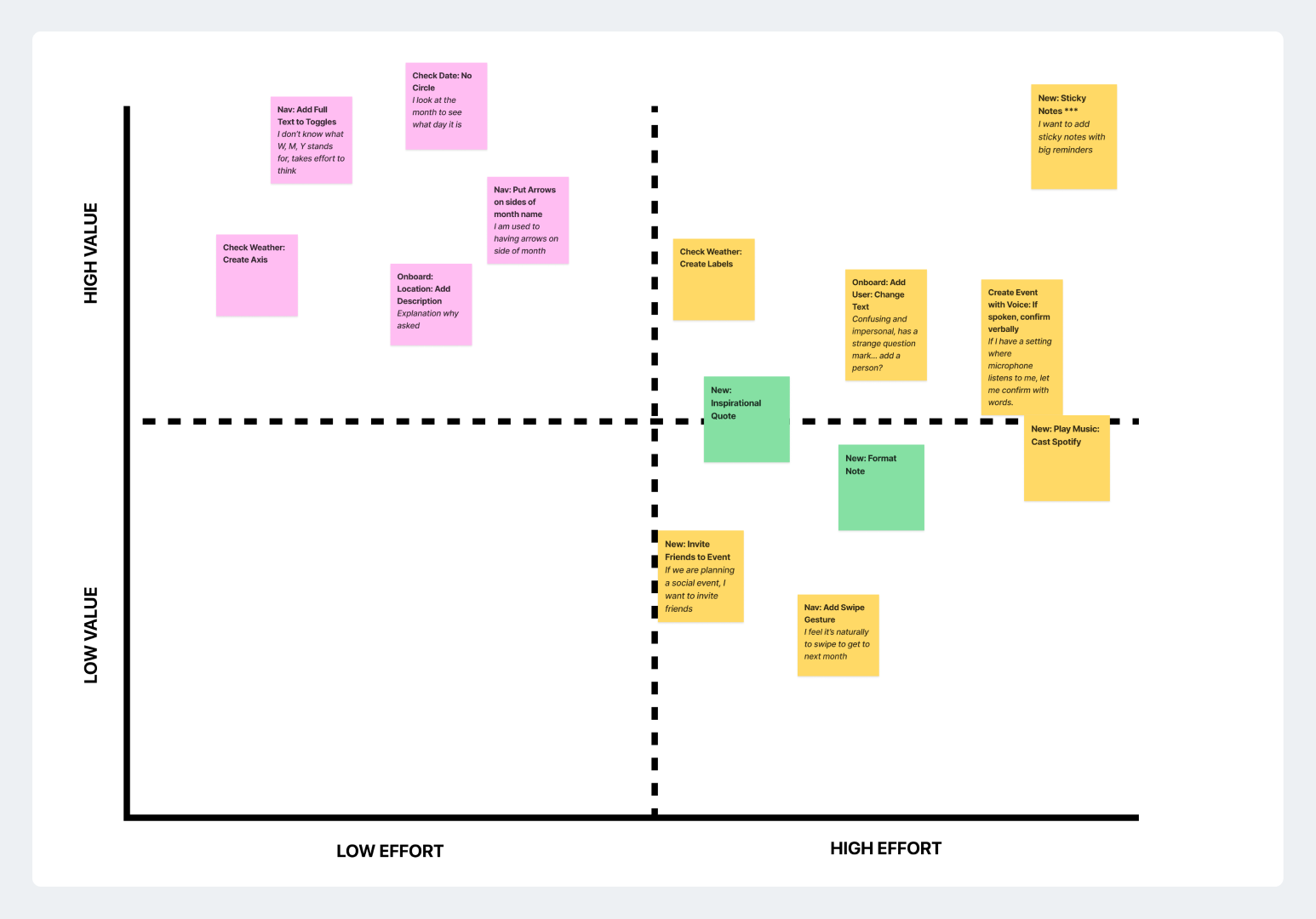
Design Prioritization Matrix
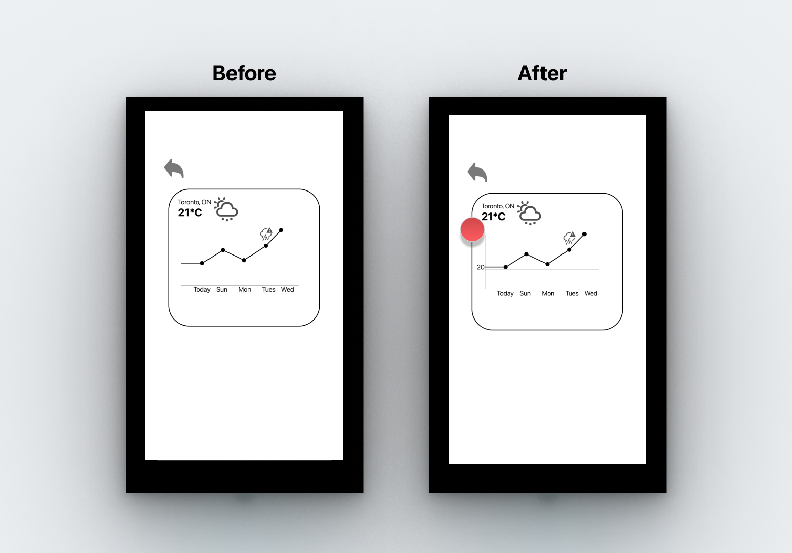
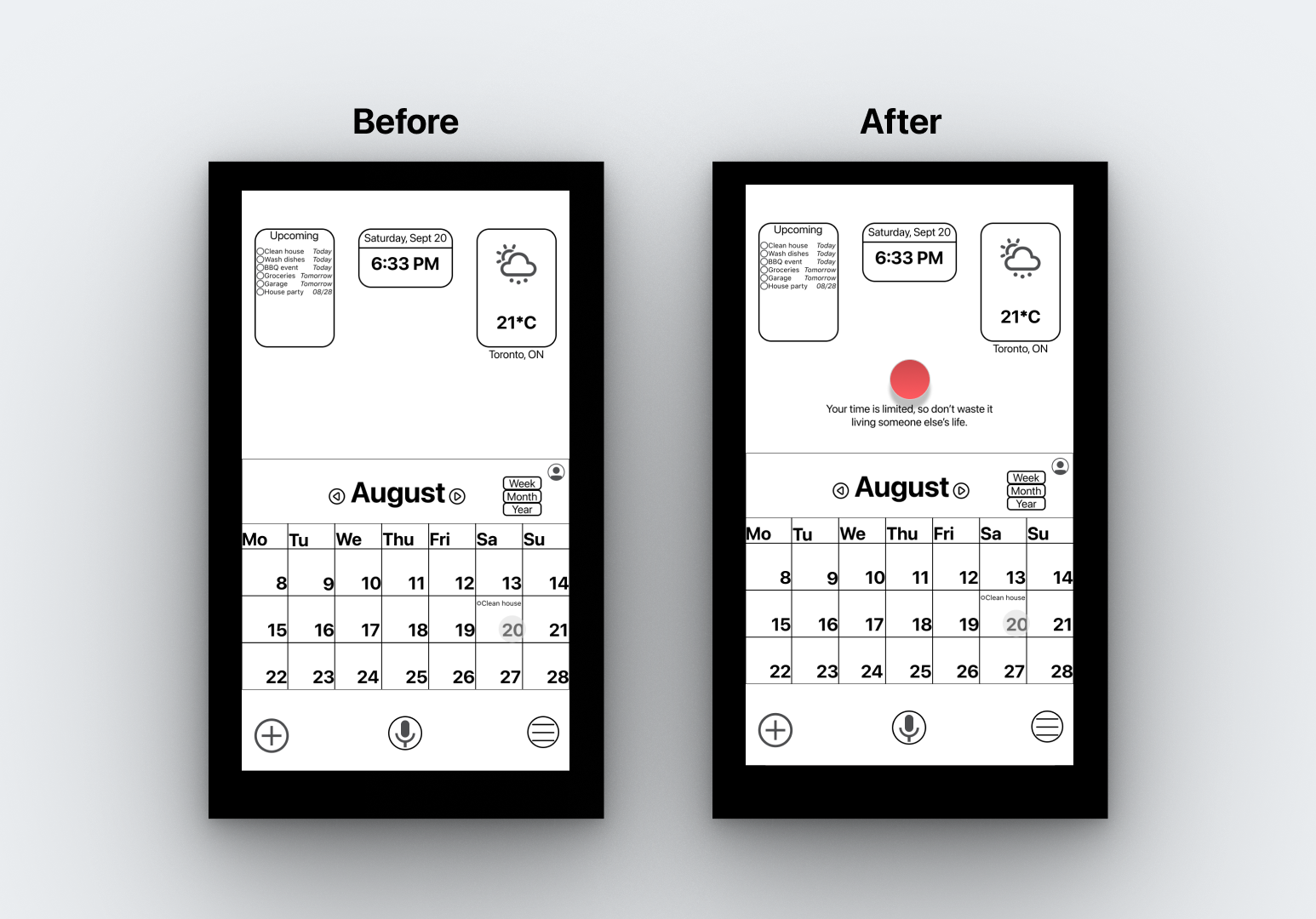
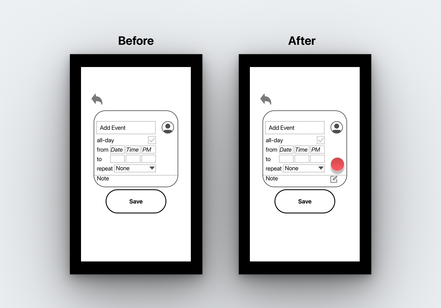
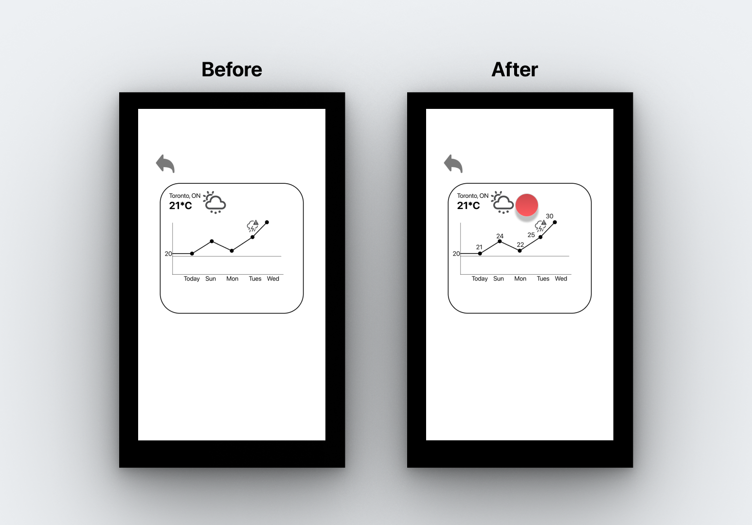
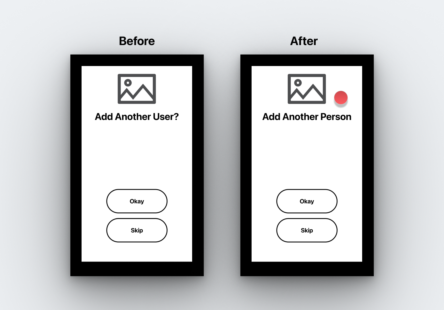
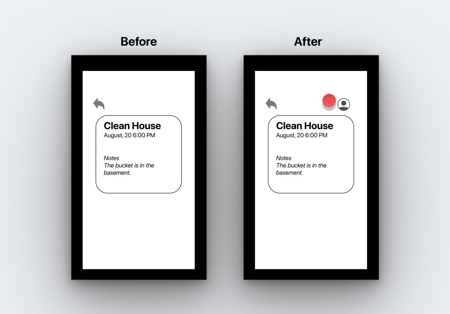
Prototype Iteration Changes
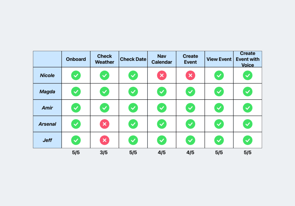
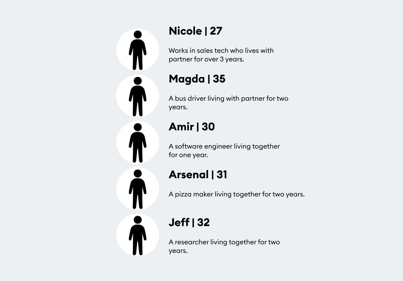
User Test Participants
User Test Results

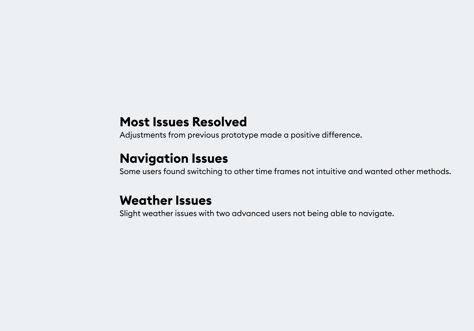
Overall Task Analysis
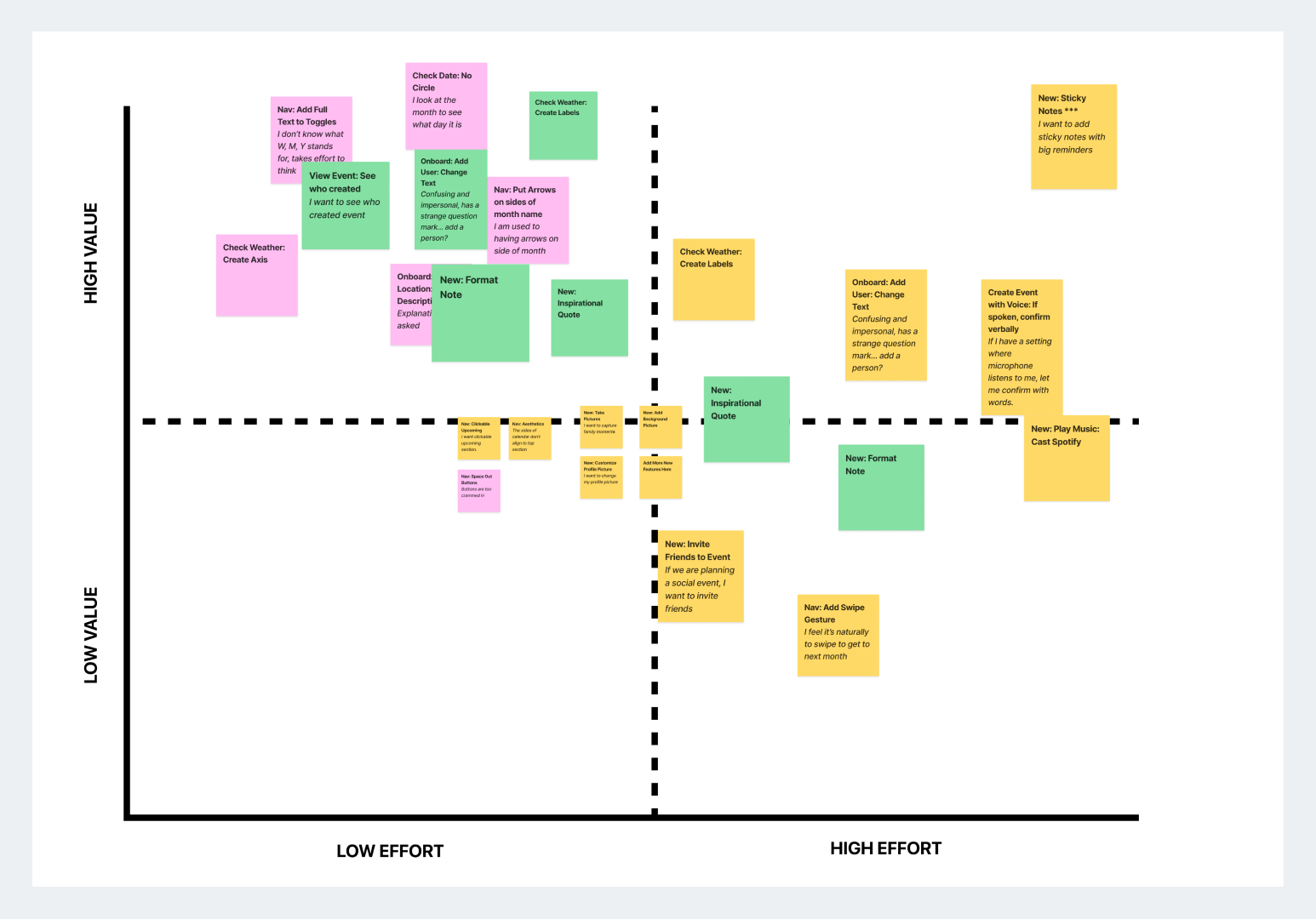
Design Prioritization Matrix
Prototype Iteration Changes
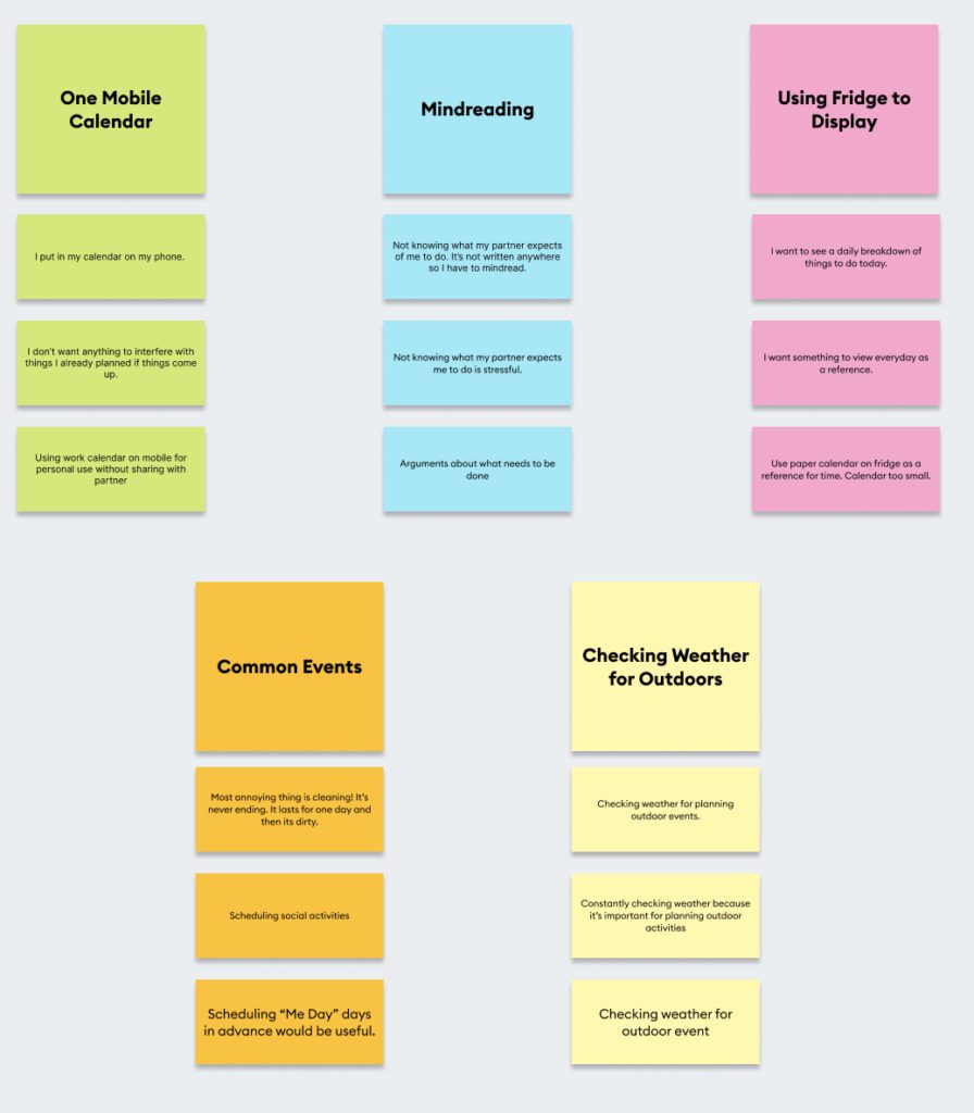
Key Learnings from User Testing Method
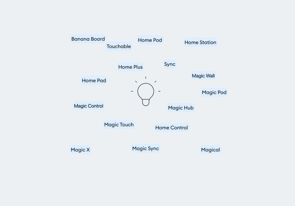
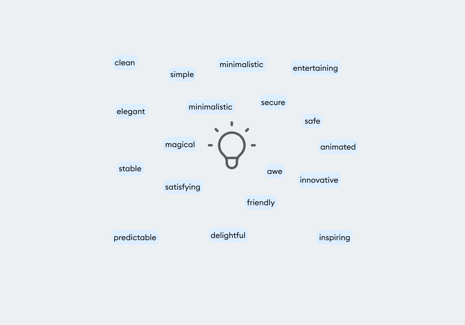
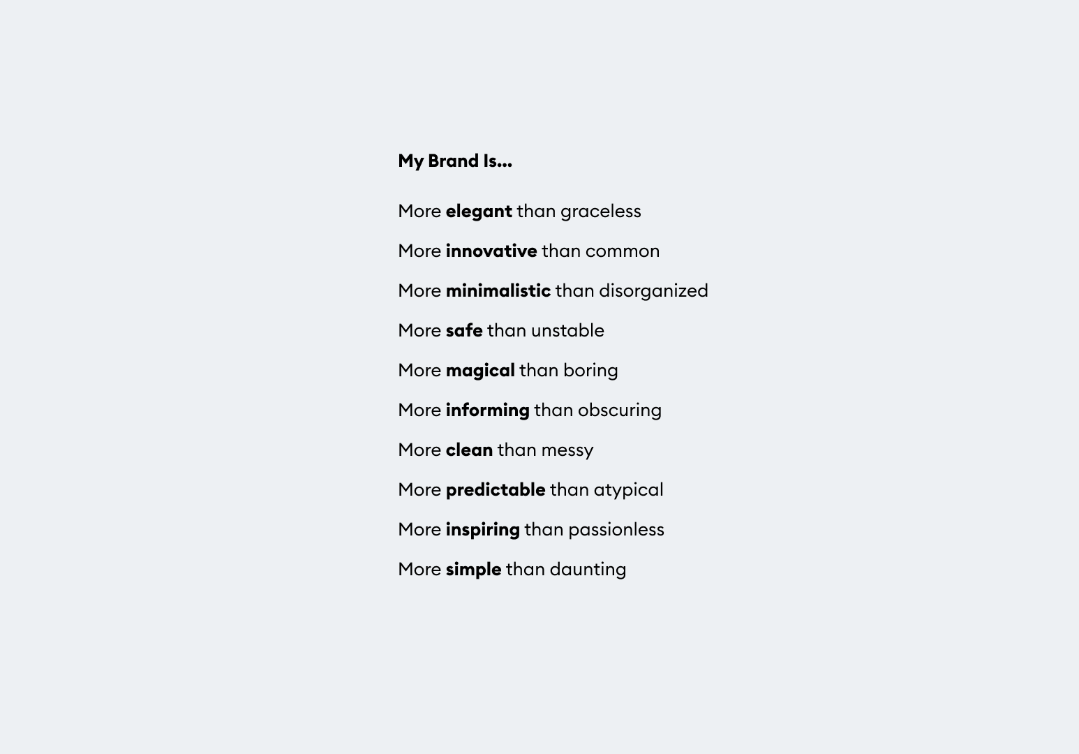
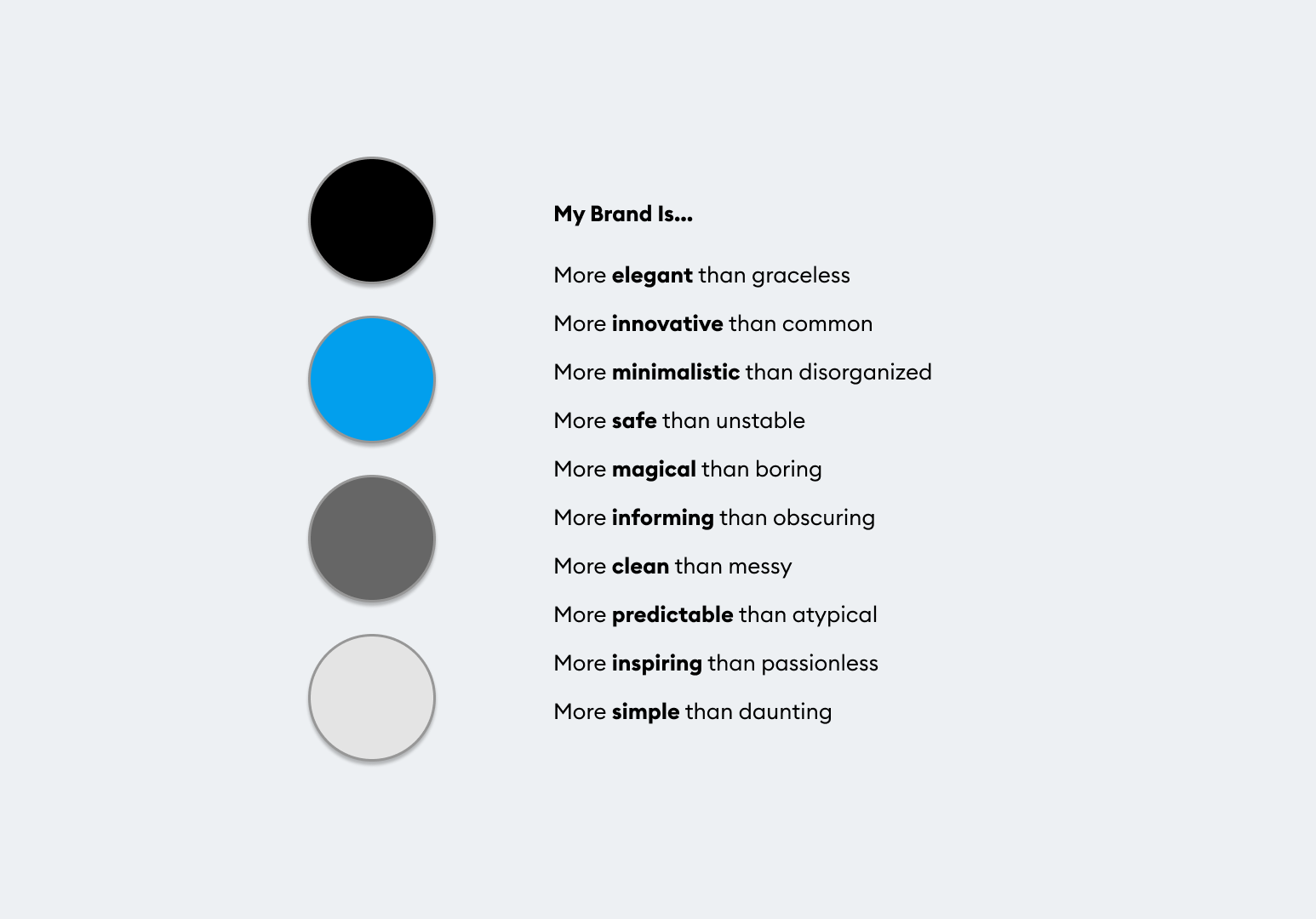
Brainstorming Adjectives
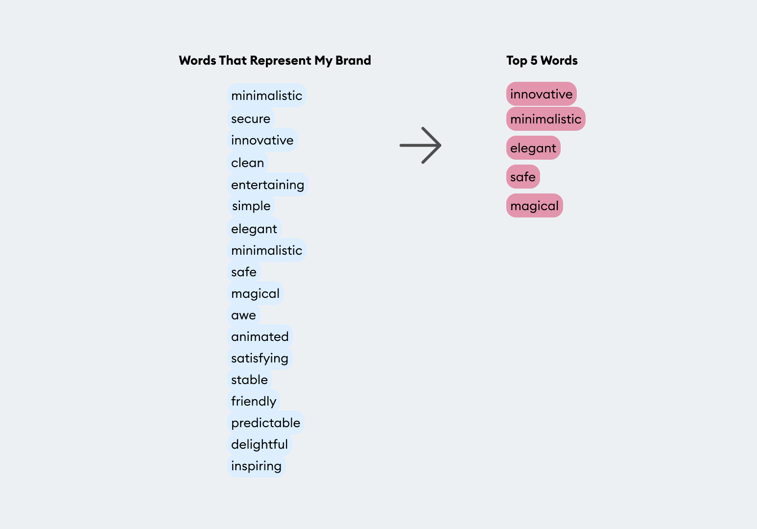
Top Chosen Words
A More Than B
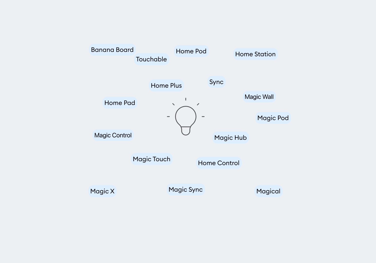
Potential Names
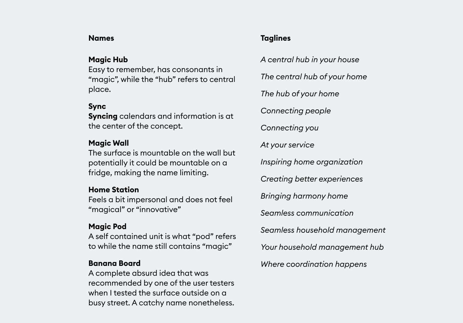
Brand Names
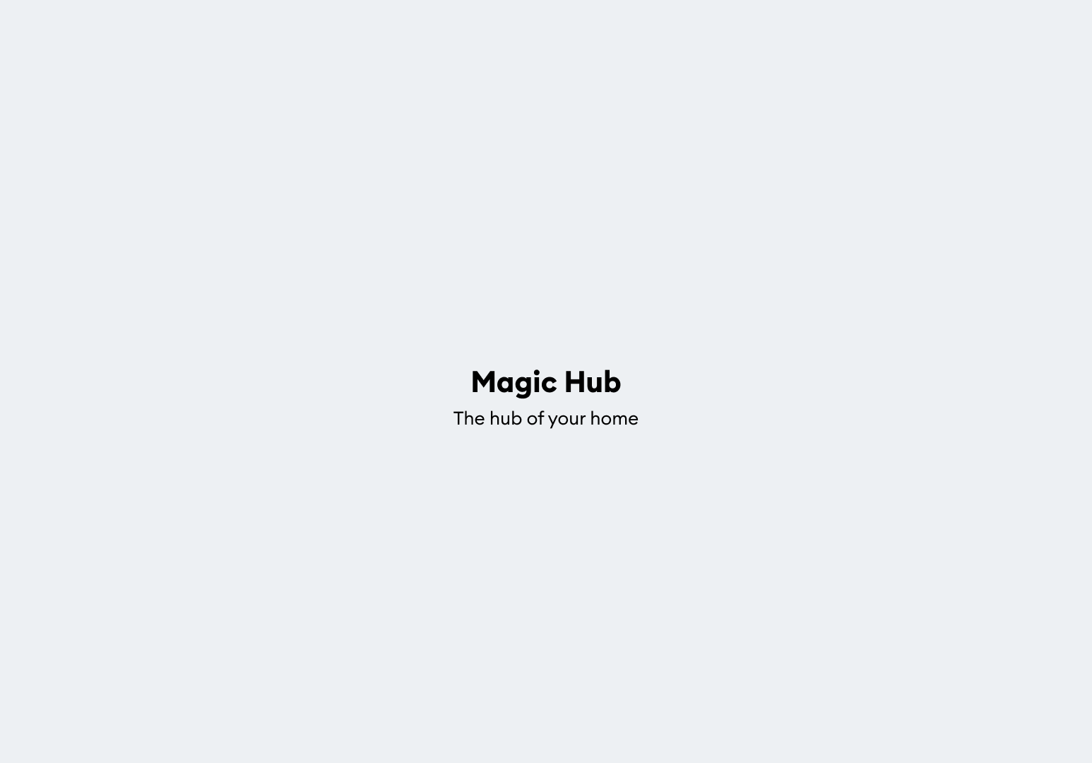
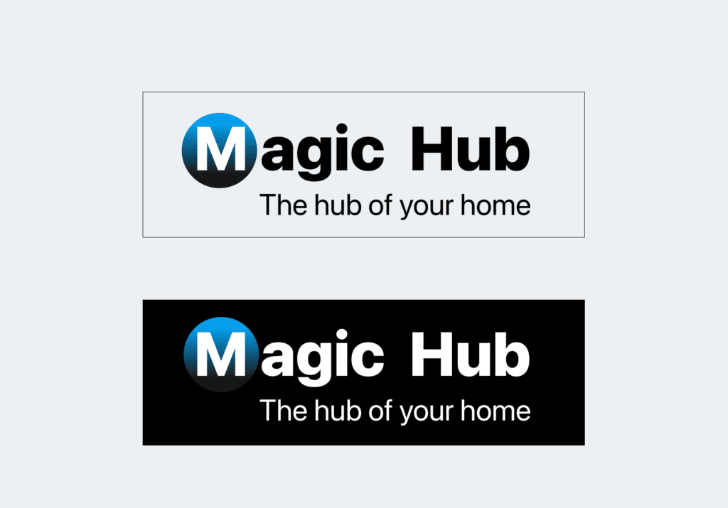
Selected Name
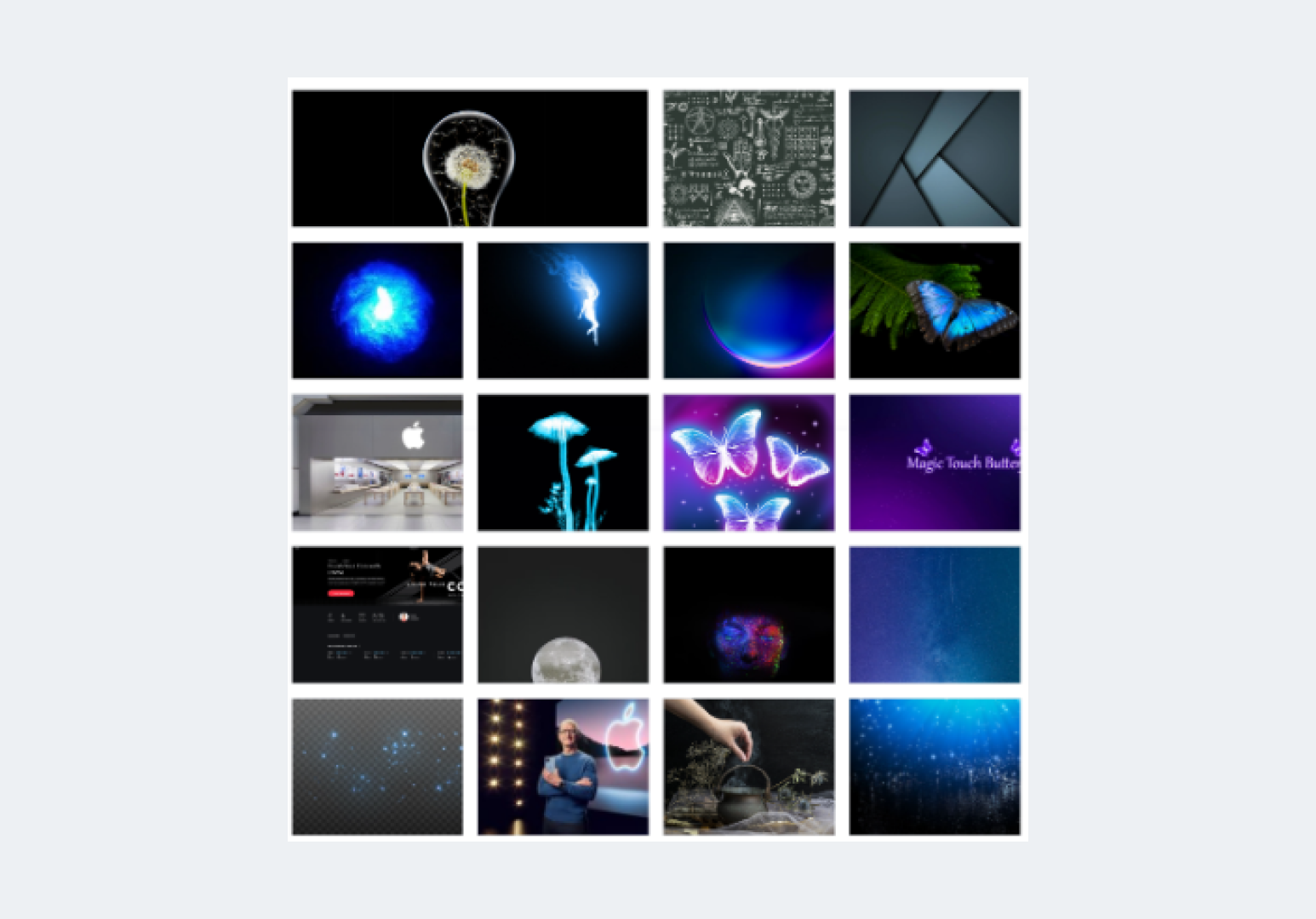
Moodboard
Typographic Inspiration

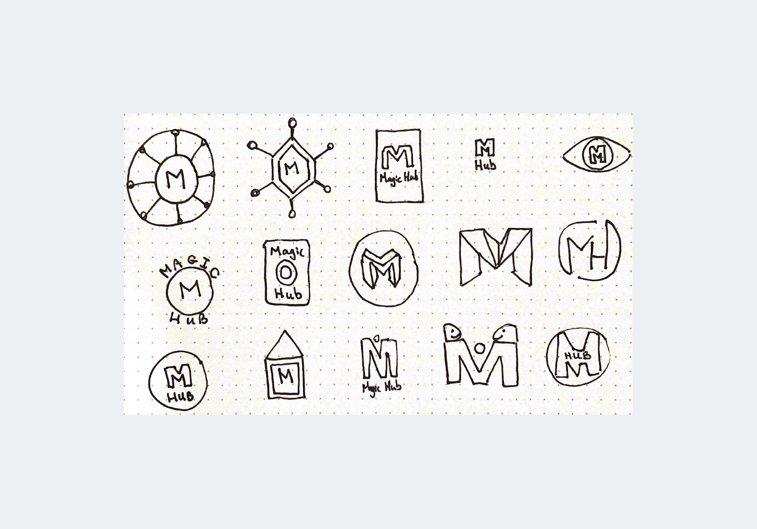
Letter Sketching
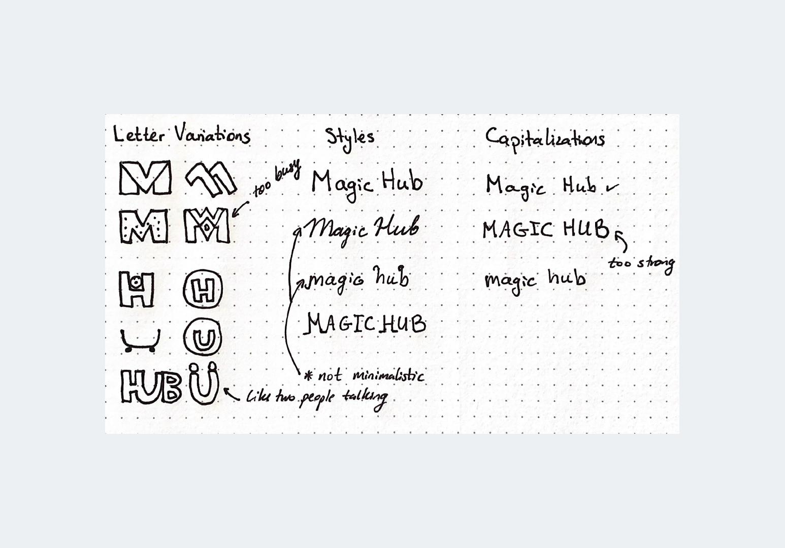
Symbol Variations
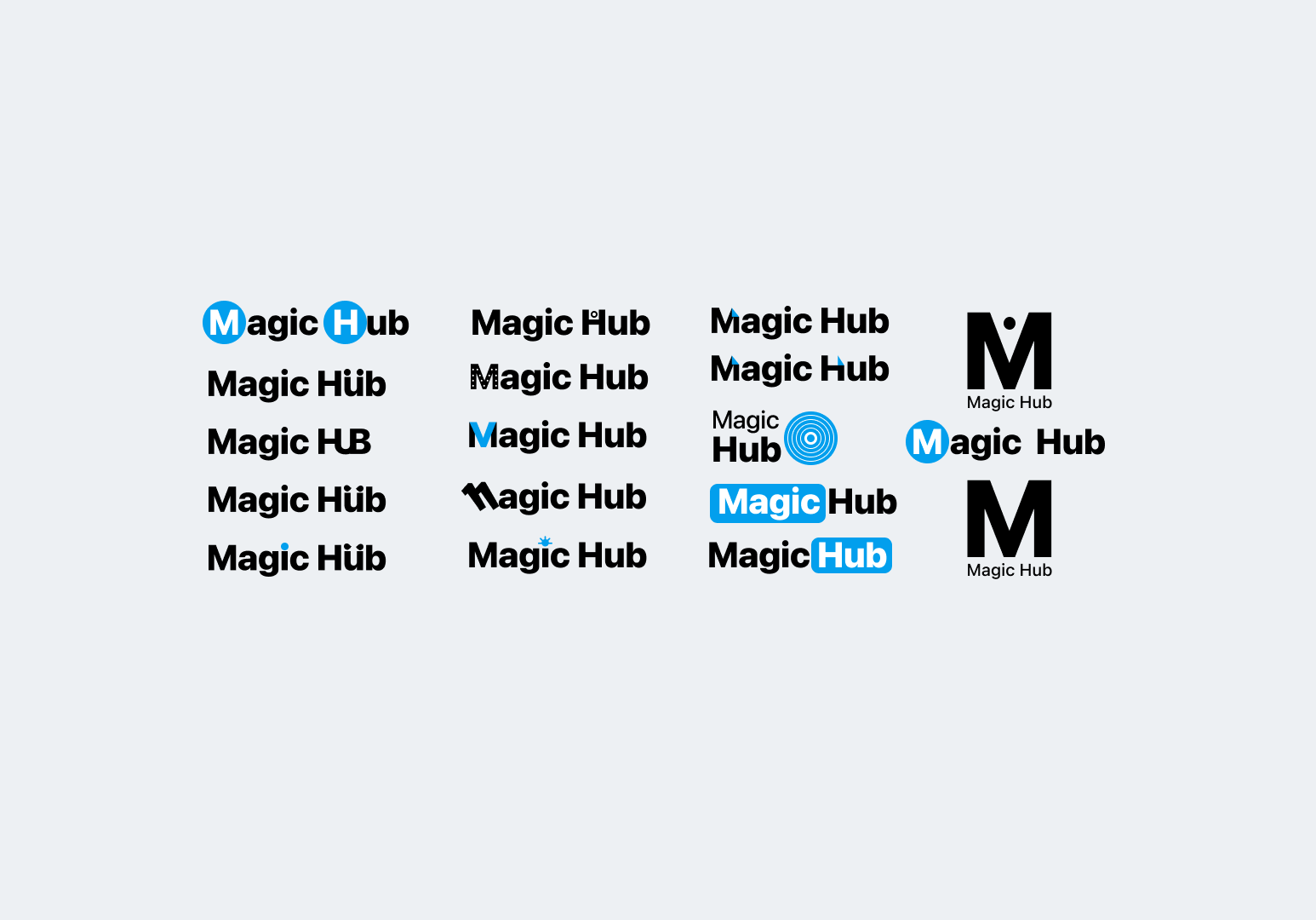
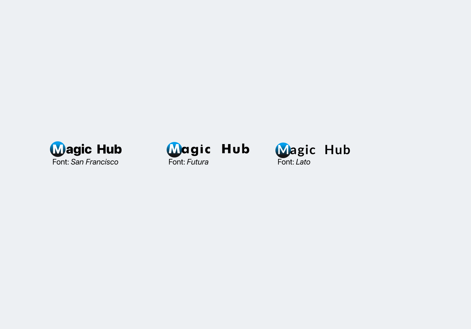
Font Variations
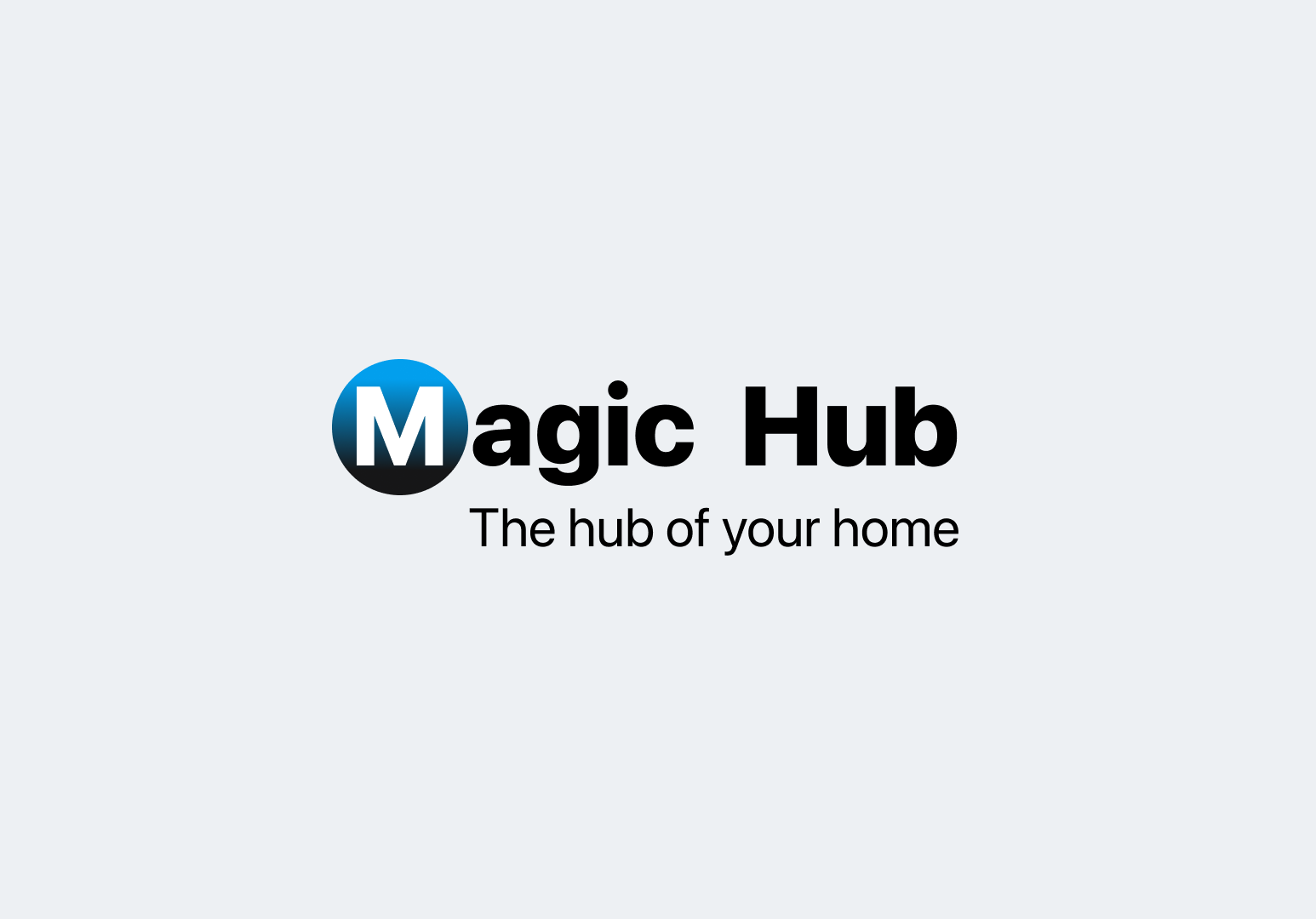
Selected Mark
High Contrast Versions

Icon Ideation
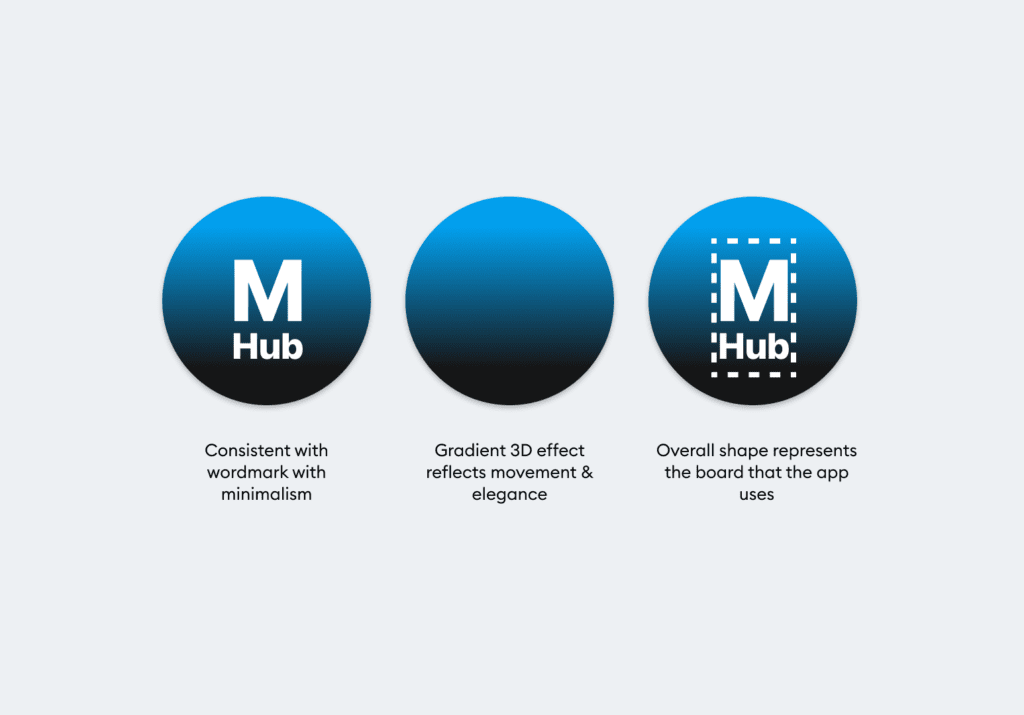
Icon Design
Symbolisms

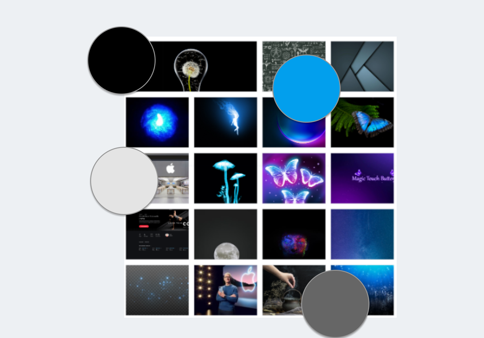
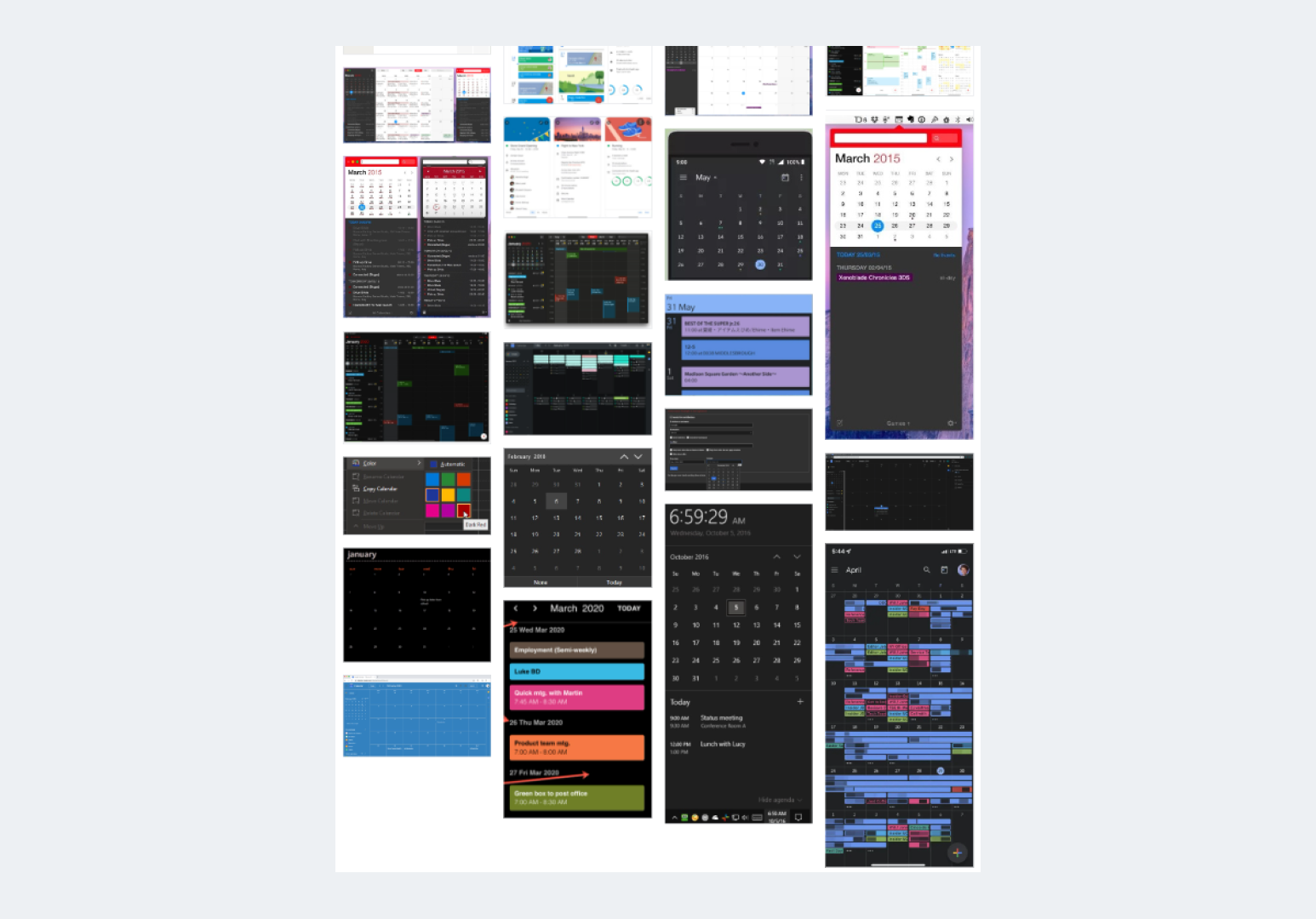
UI Inspiration Board
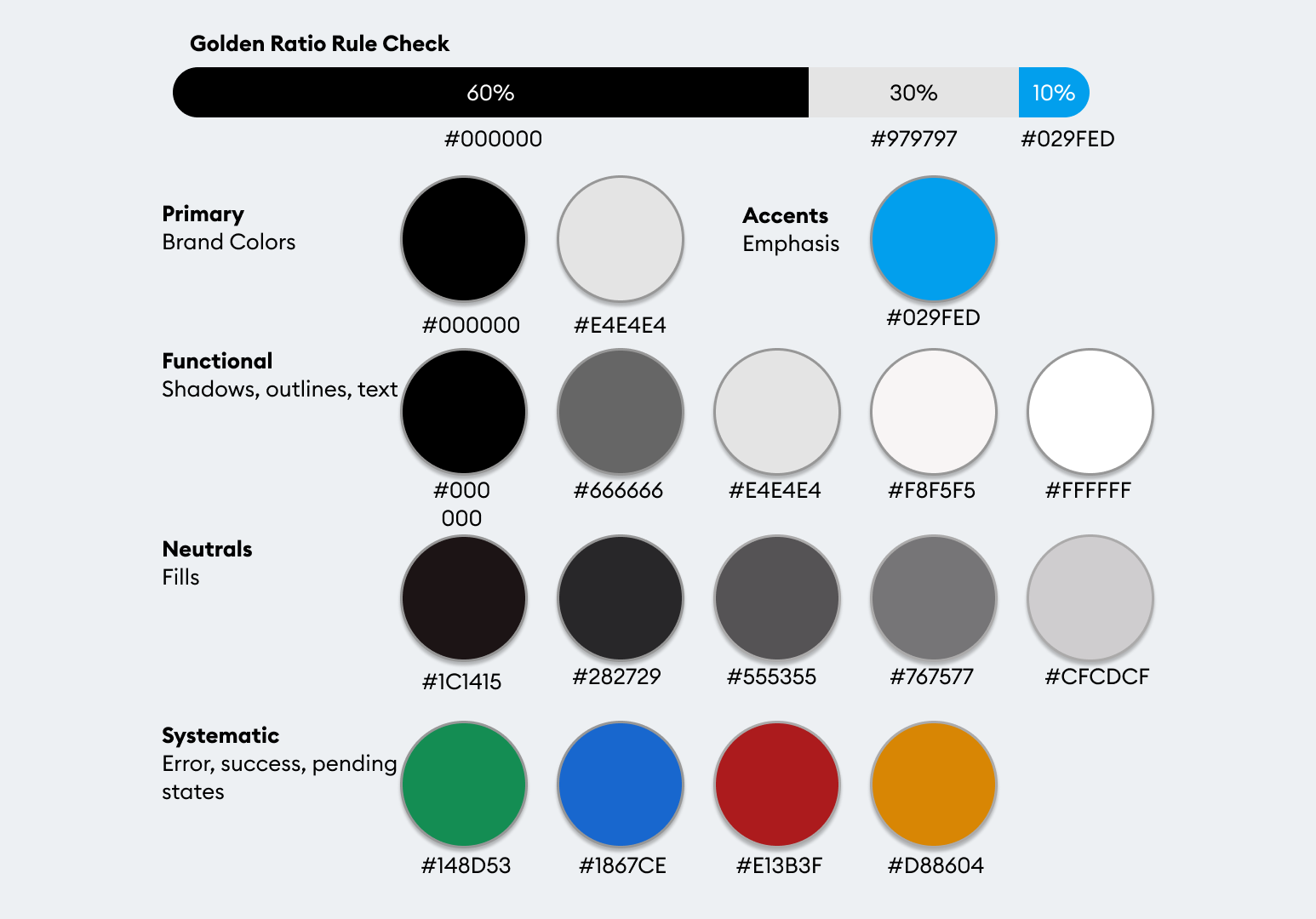
Color Extraction
Fit with Brand
Color Psychology
Combining Colors
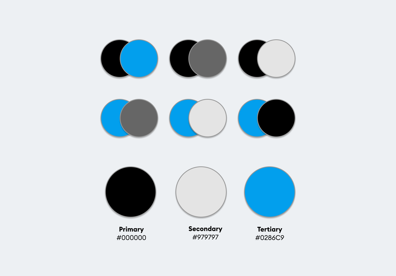
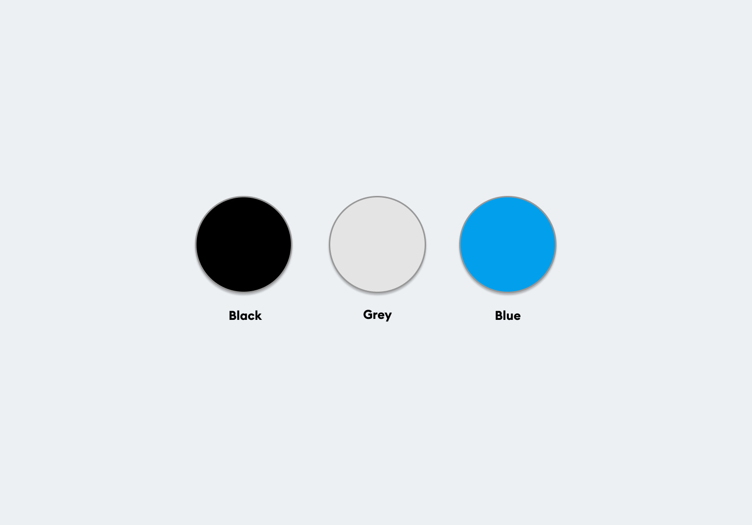
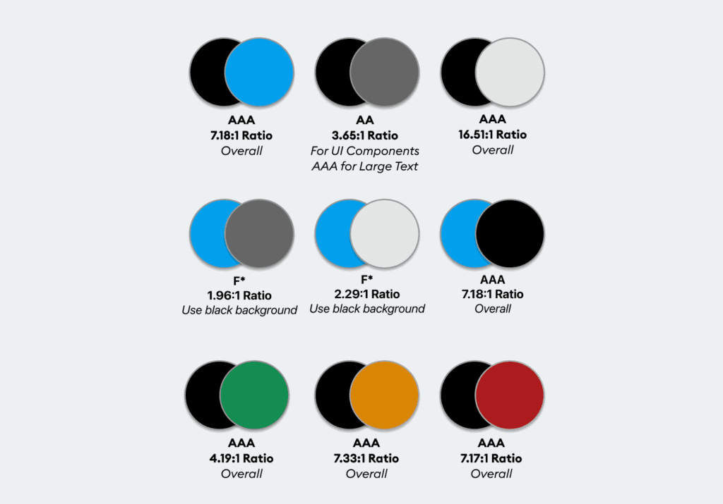
Color Palette