
Tim Hortons Mobile App Heuristic Improvements.
Conducted heuristic analysis of Canada’s Tim Horton’s iOS mobile app for user flow of a persona trying to redeem points. As a result, key points throughout the user journey were identified and design was created to reflect improvements that increase business value. Our team won 1st place for presenting business driven design suggestions based on analysis.
- Client BrainStation / Tim Hortons
- Timeline 1 Month
- Skills Figma, Miro
My Role
As a UX Team Lead Designer, I led a team of 2 UX Researchers to conduct comprehensive heuristics analysis to improve the mobile app experience and was involved with designing the visuals of prototype. I proposed to improve this app after a personal experience of being a user tester for marketing agency that was involved creating Tim Hortons app.Â
Business Goals
At the beginning of the project I set personal goals on top of correcting heuristic issues including :
- Increase Retention: create a positive experience for users to return to the app
- Increase Average Order Quantity: increase the likelihood of accumulation of points and redemption
- Increase User Satisfaction: increase satisfaction of the app through corrected heuristic issuesÂ
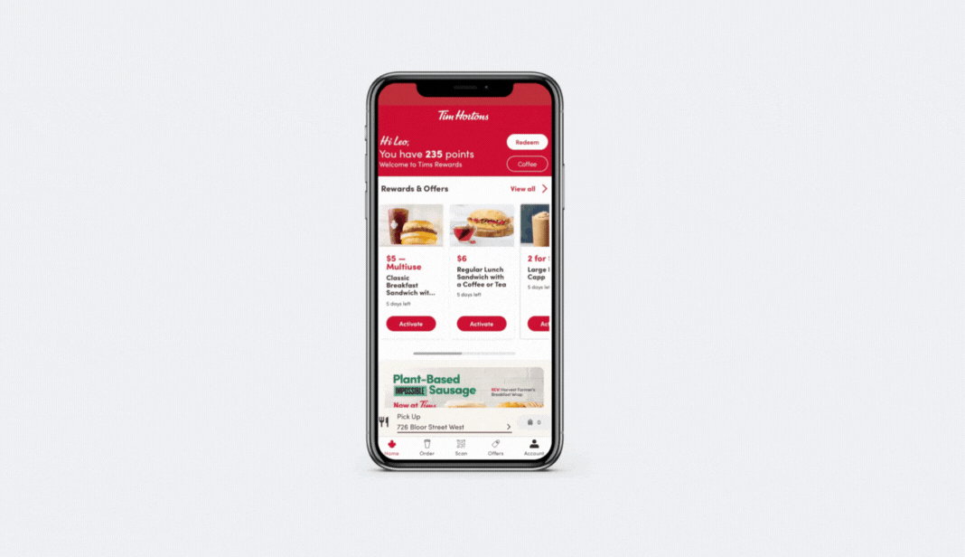
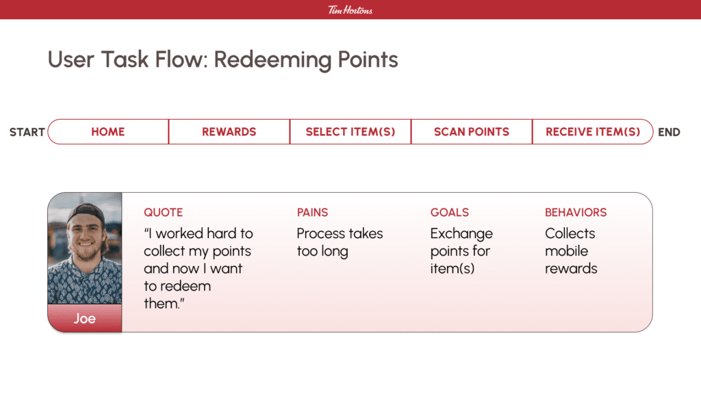
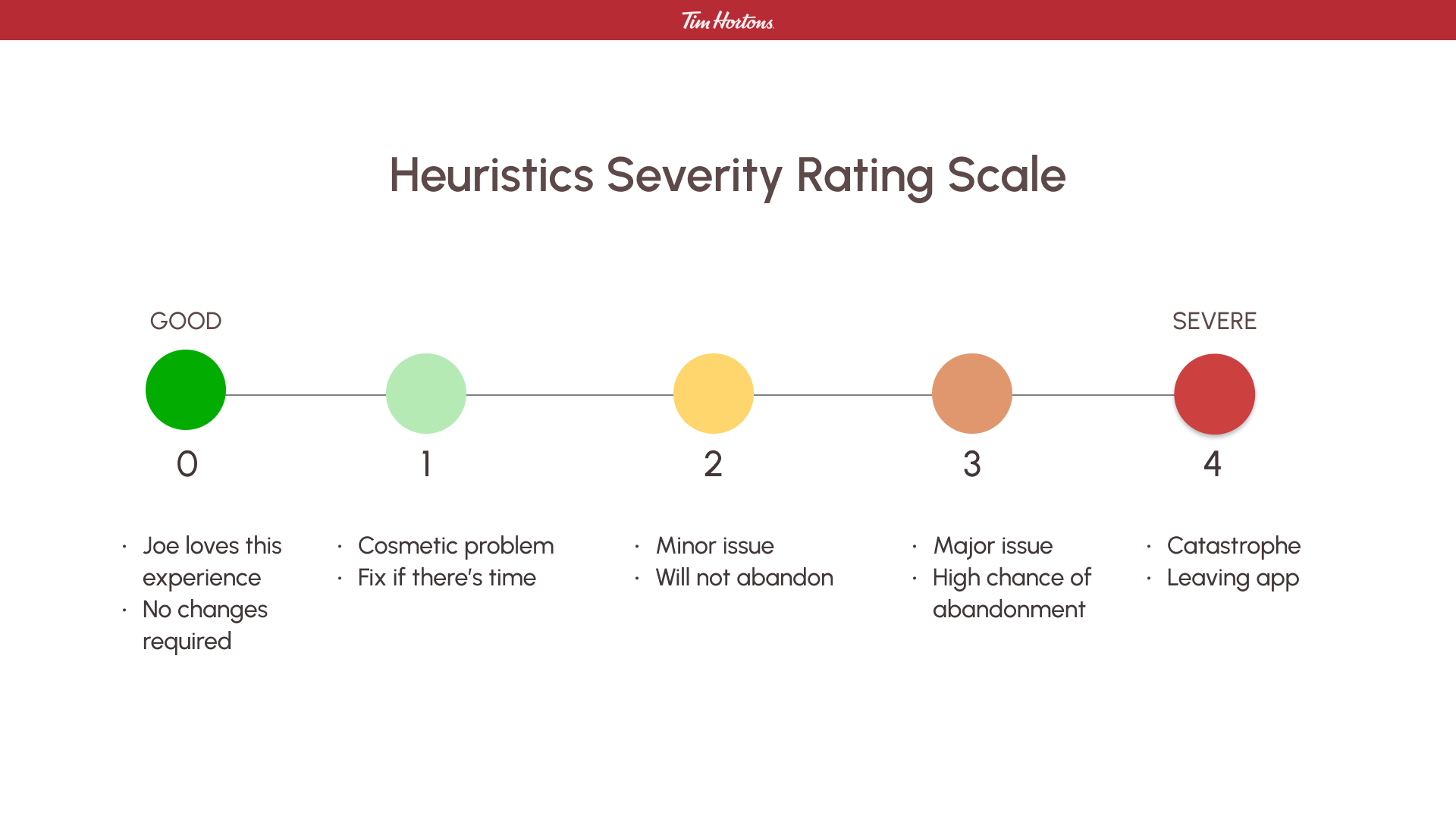
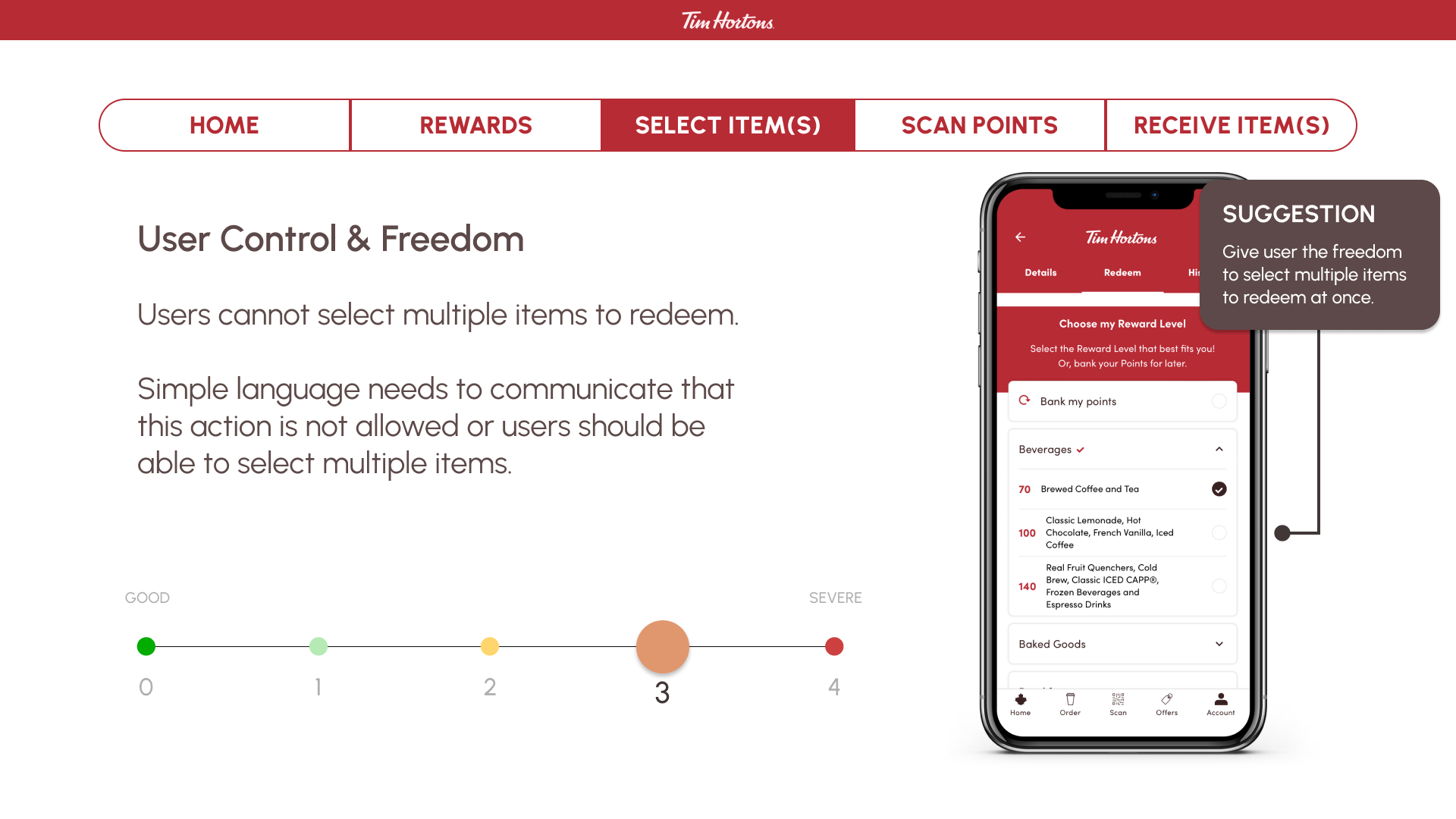
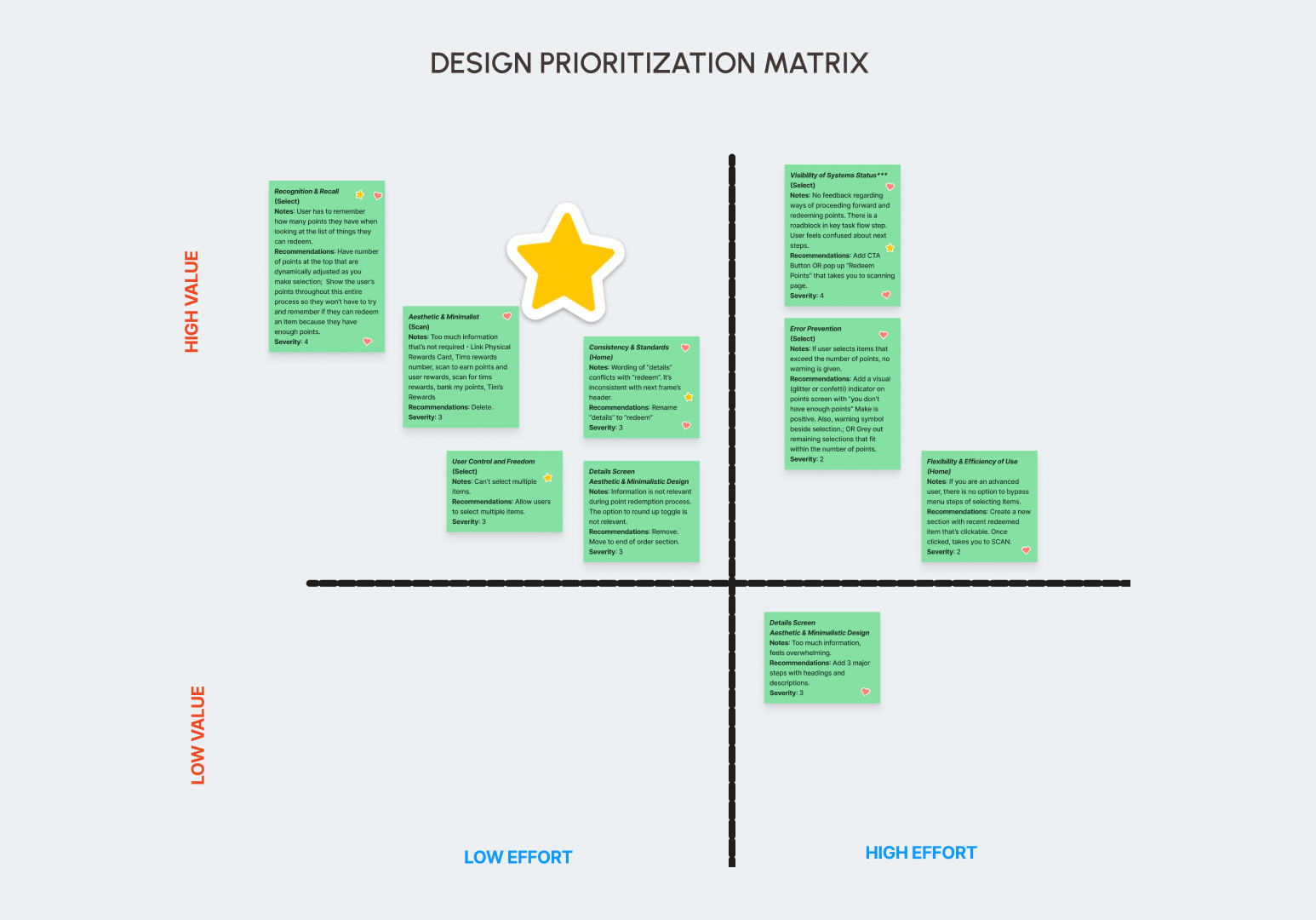
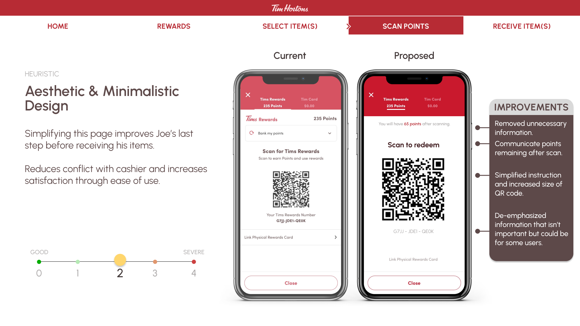
Our team applied the heuristic evaluation to the Tim Horton’s app. We found seven heuristic issues and prioritized three that had the greatest impact on the user’s experience using efficient design solutions. Our approach was through the lens of a returning user looking to redeem their rewards.
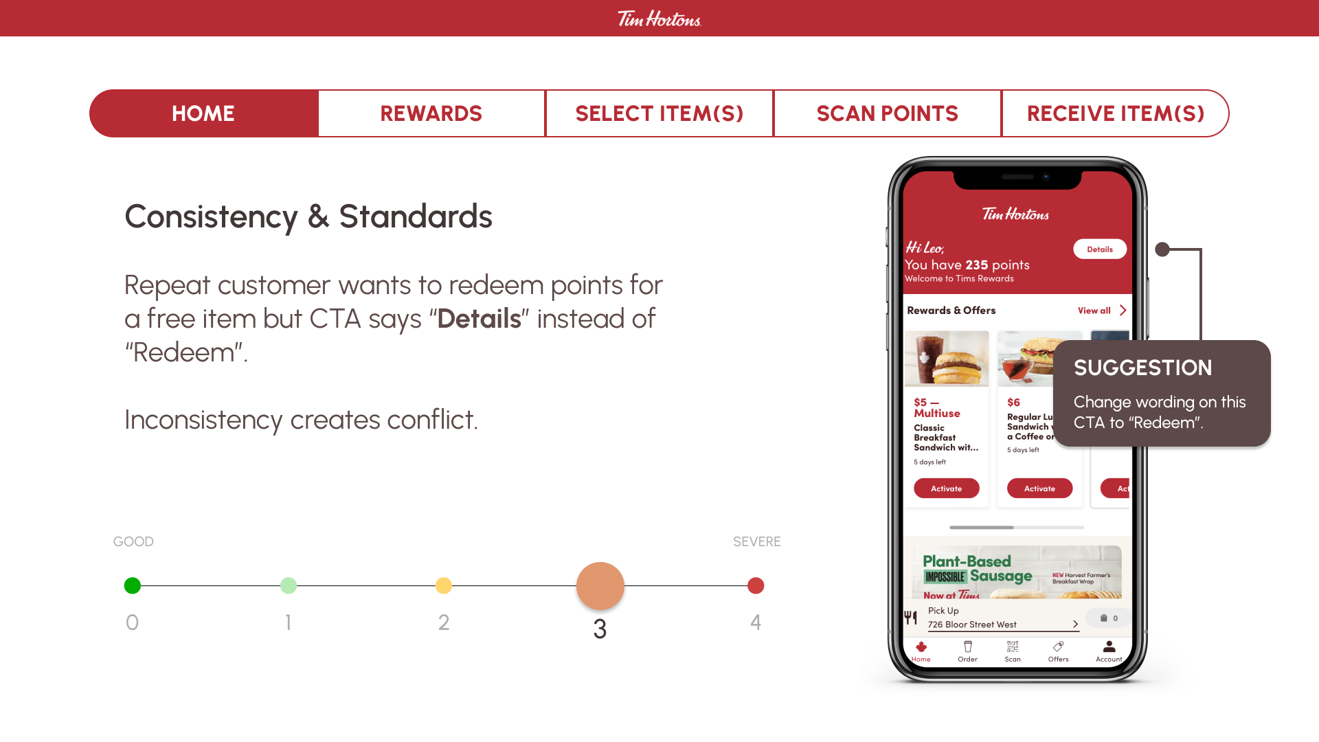
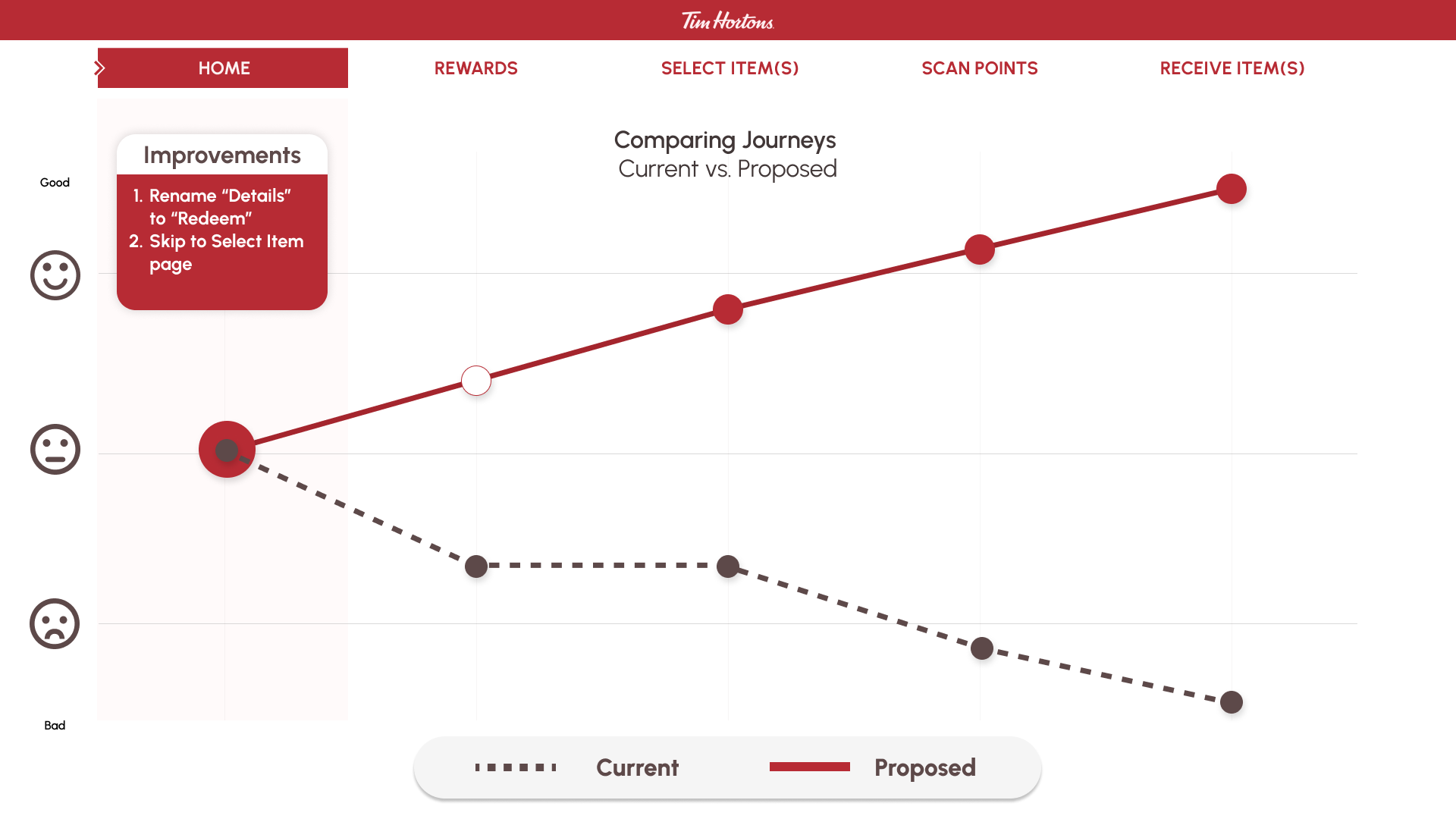
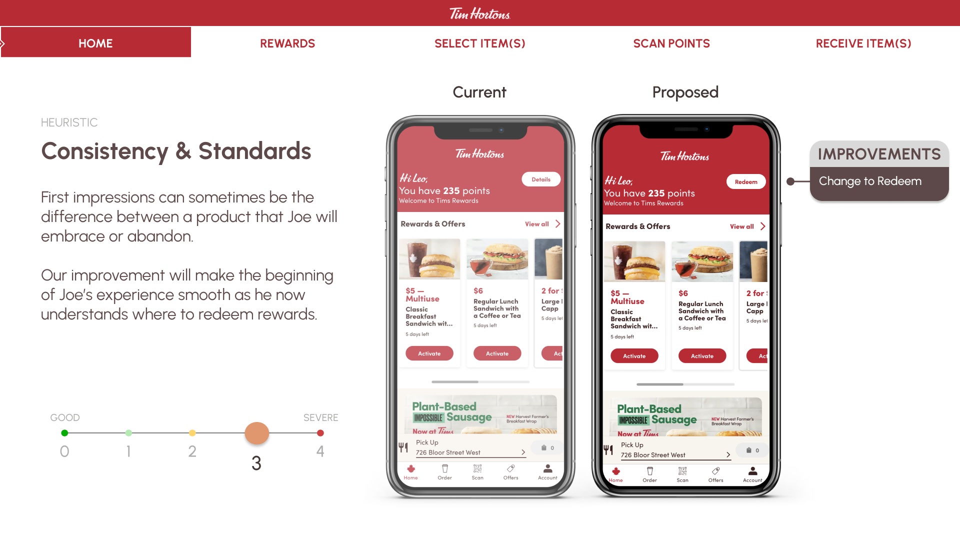
The most impactful heuristic was Consistency & Standards on the Homepage. We discovered that the header, which states to redeem awards, left the user confused as there was no action to take. To resolve this issue, we recommend deleting the “details” button text and replacing it with a “redeem” instead. This will eliminate confusion and frustration of the user and lead them seamlessly to the next screen.
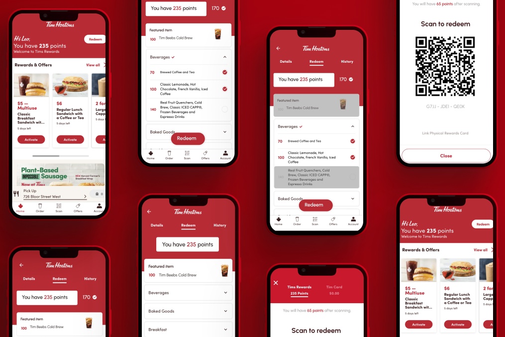
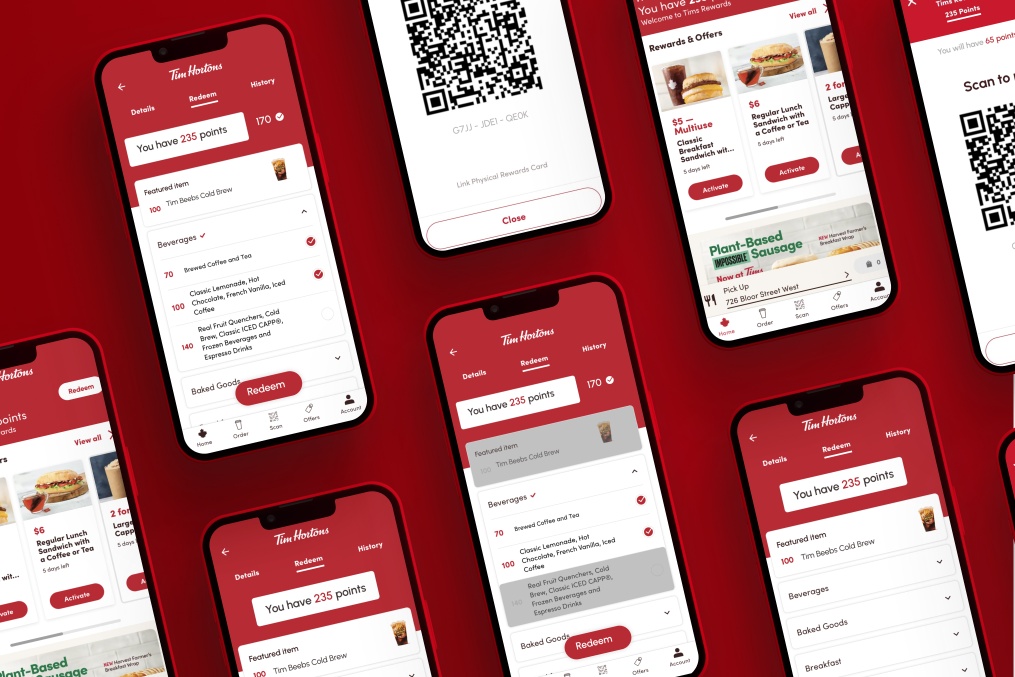
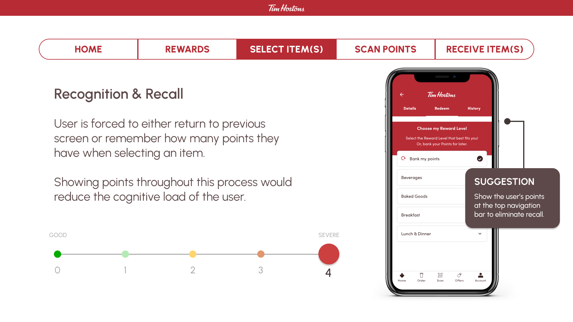
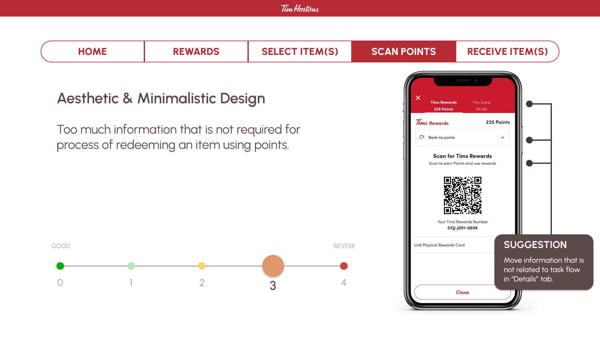
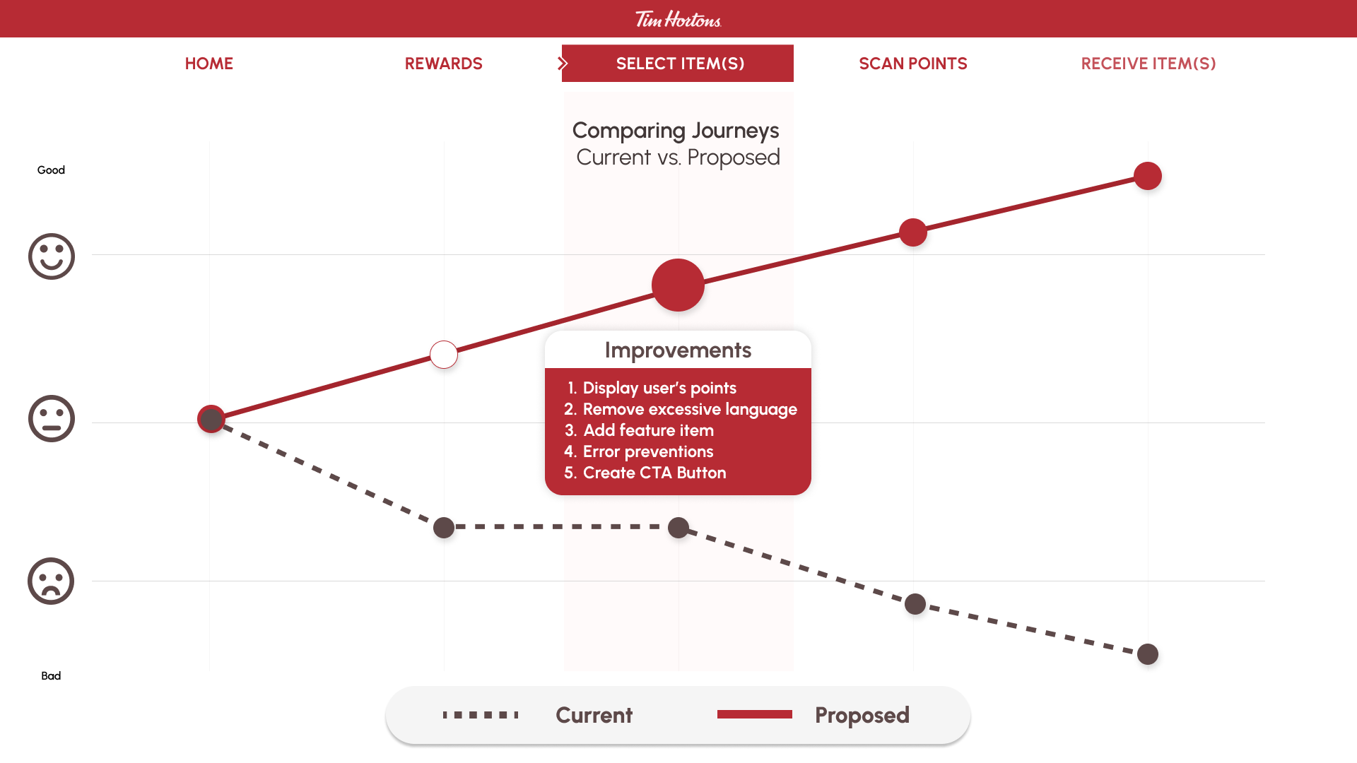
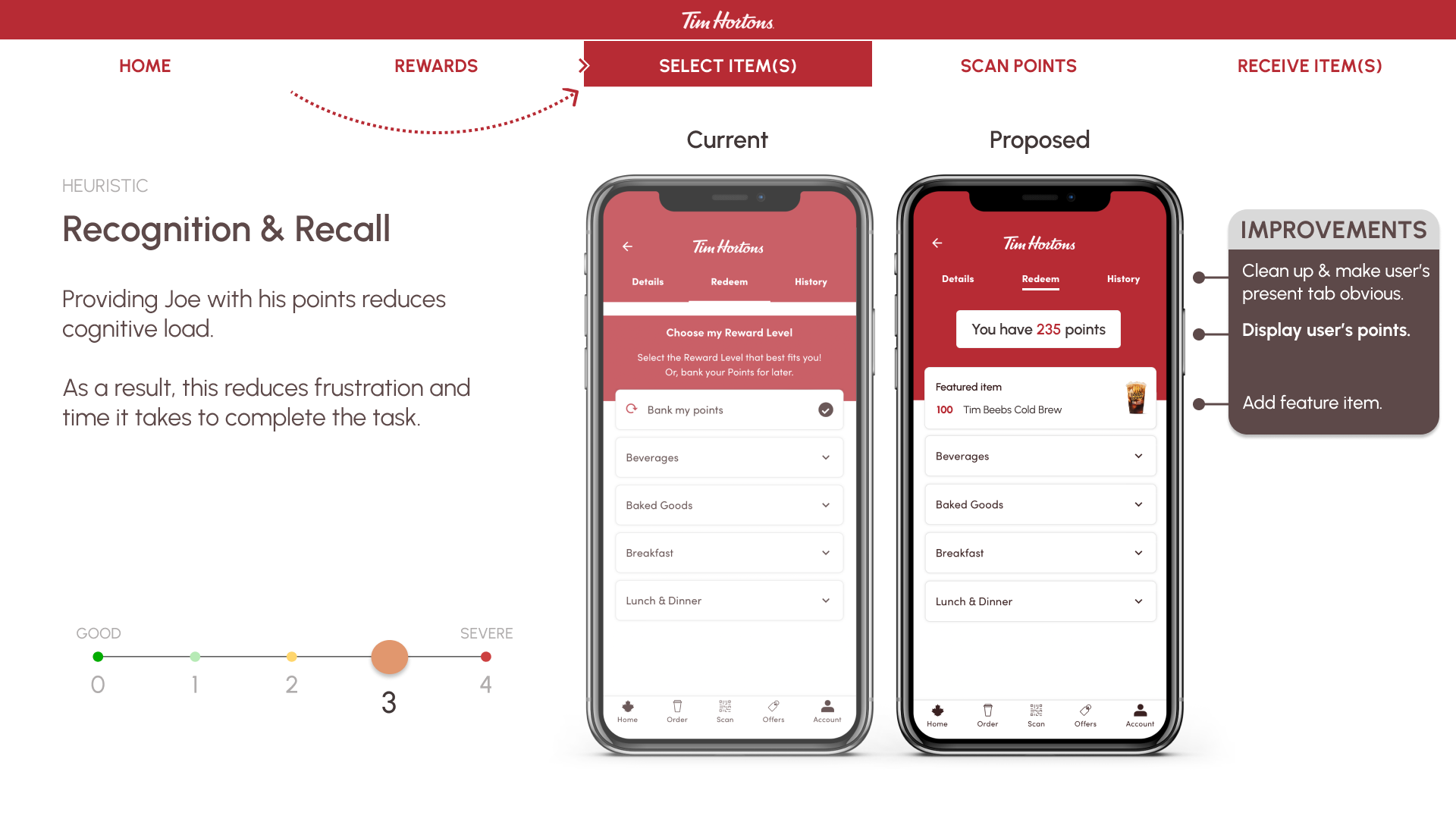
The second most impactful heuristic is Recognition and Recall on the Details page. Here, we noticed that in attempting to redeem rewards, the amount of points are missing. Our recommendation is to have the points visible on the header to avoid the frustration of recalling that information.
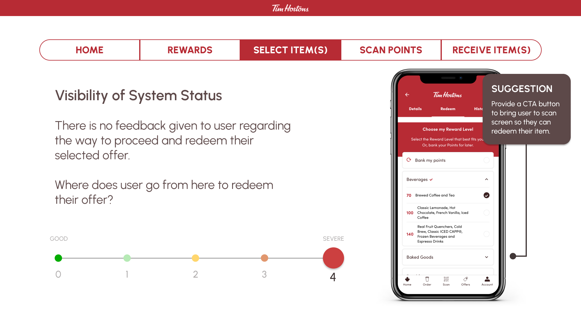
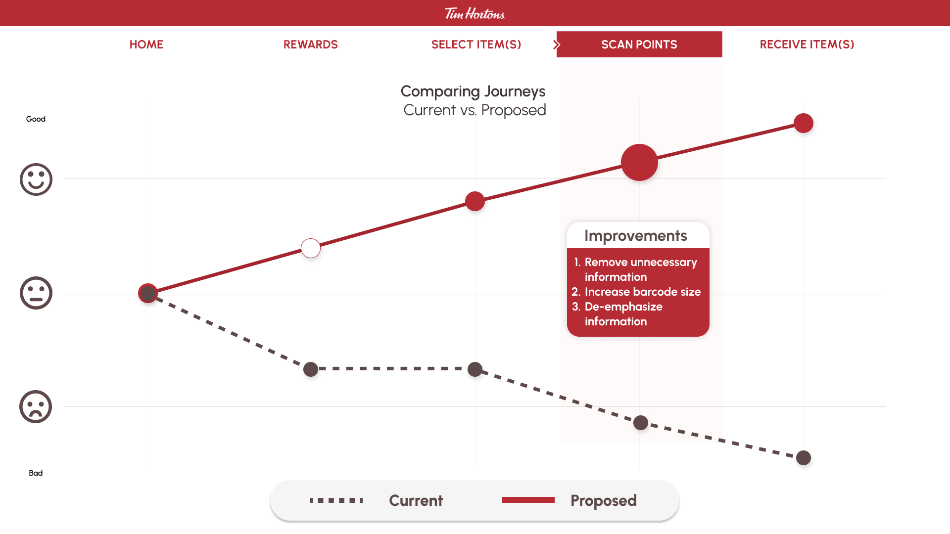
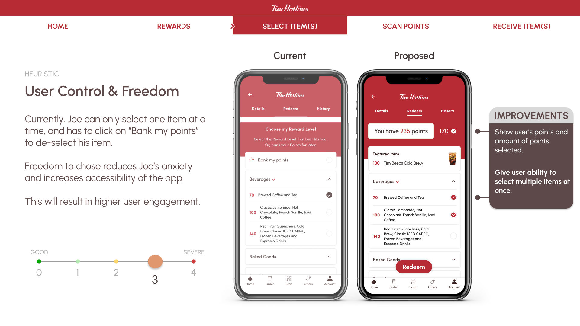
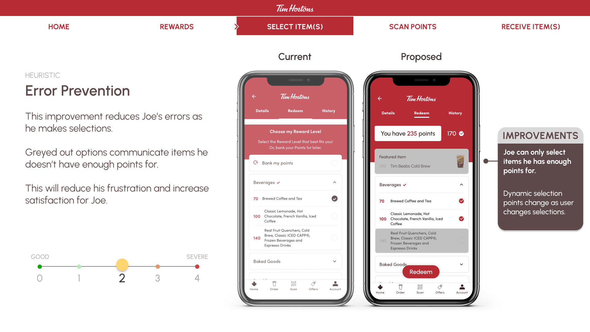
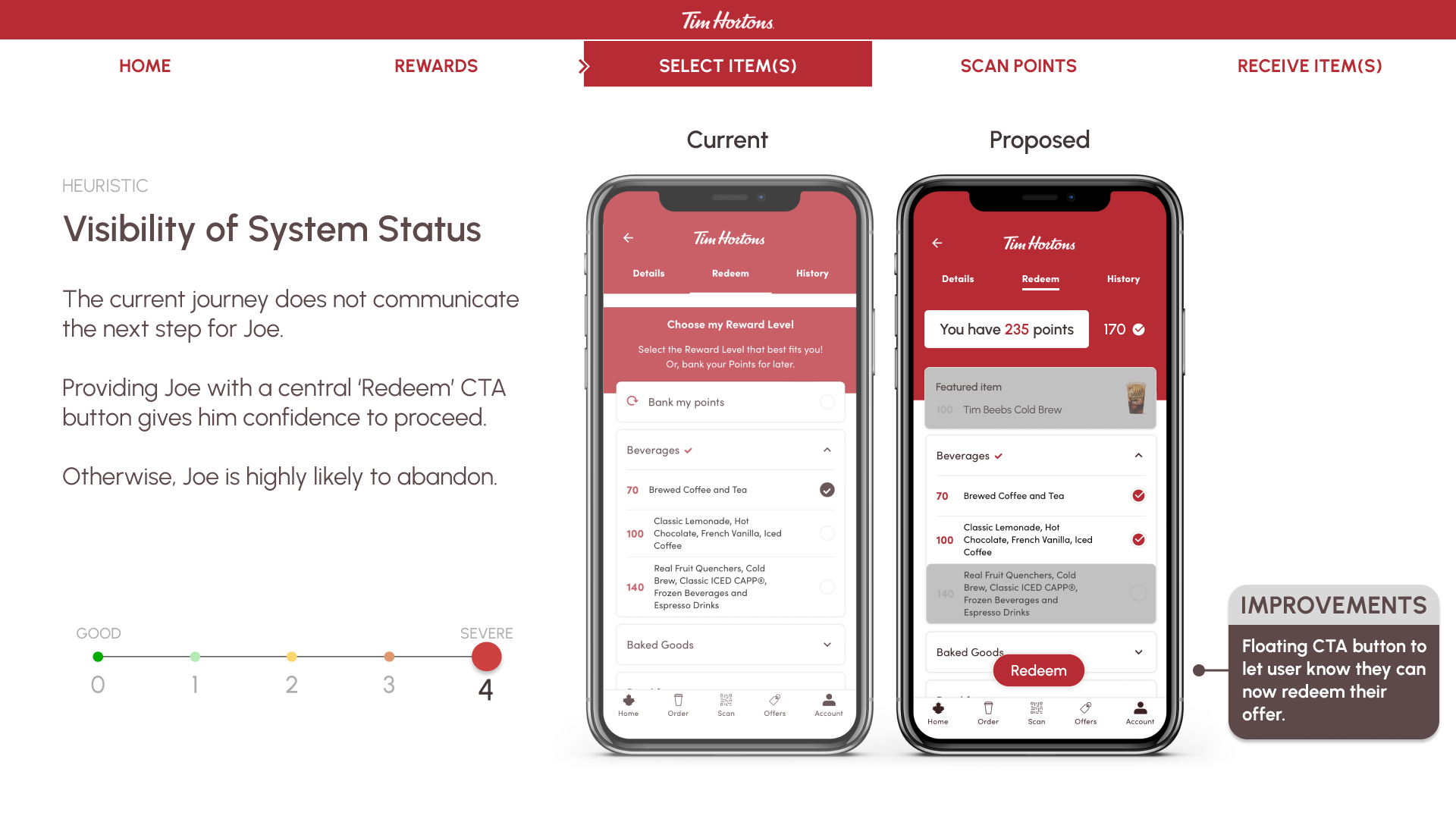
The third most impactful heuristic was Visibility of Systems Status also on the Details page. We found that after selecting an item to redeem, there was no next step provided, leaving the user at a dead end. To rectify this confusion and frustration, we propose a call to action button to lead the user to scan and complete their task.
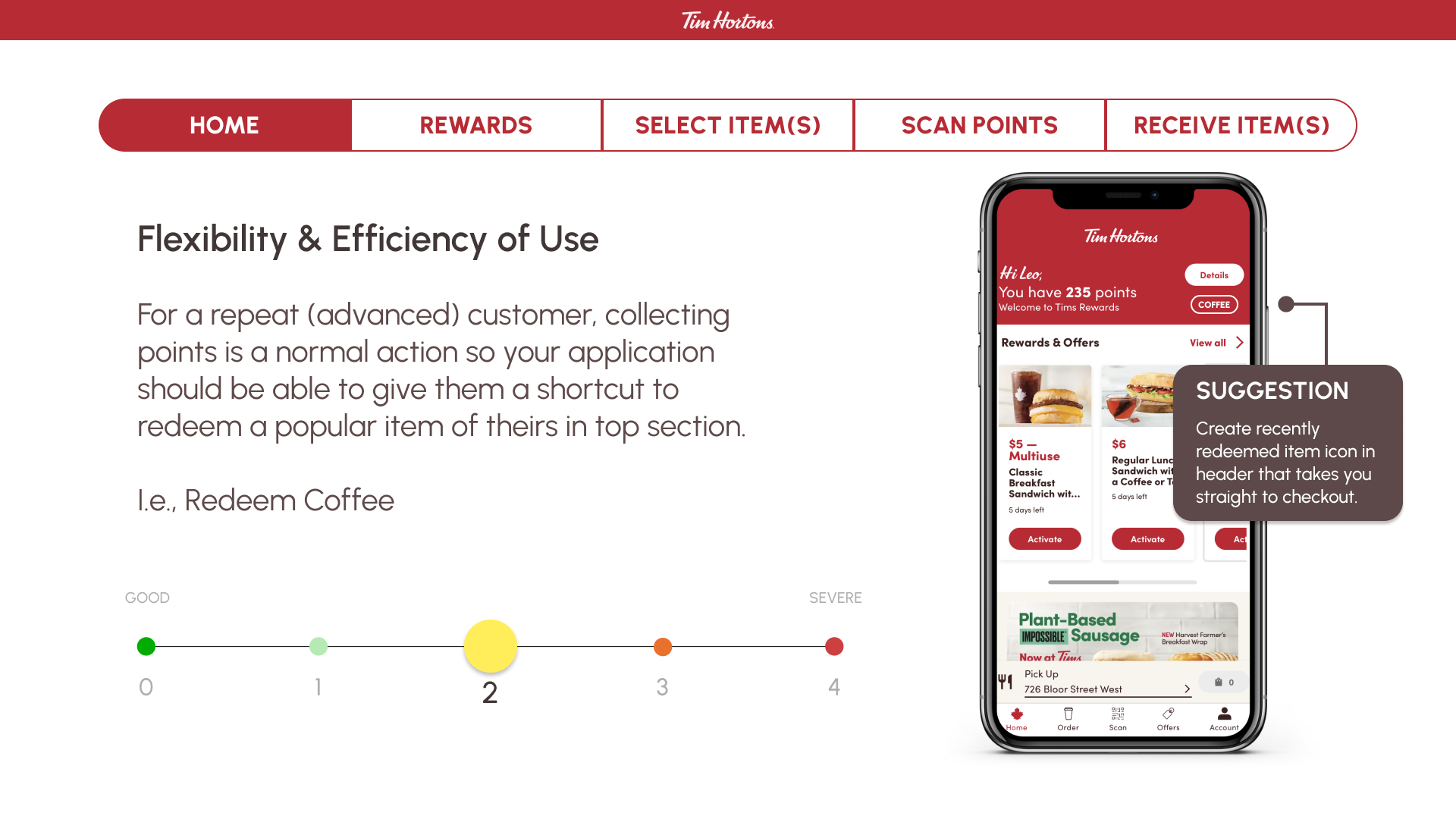
Overall, our team prioritized heuristics and solutions that would provide the user with the most value and feasible design effort.
Heuristics Analysis Process
A heuristic evaluation framework developed by Norm Neilson Group was used. It’s a usability inspection method that helps to identify usability problems in the user interface design. It specifically involves evaluators examining the interface and judging its compliance with recognized usability principles.
Prepare
Evaluate
Consolidate
Plan
Prototype
How might we identify usability issues to create an improved design?
Personal Experience
As a regular user of the Tim Hortons app, I was chosen by a user researcher from a marketing agency that did Tim Hortons app to share feedback. After visiting several in-store locations, I noticed that it was highly frustrating for retail employees to facilitate redemption of points for people and have observed frustration in body language and voice of users trying to open the app and redeem the points. There was a significant cost for business and user experience.

Main Functions of App
After user testing the app among the team, Redeeming Points function was chosen because it provided most overall frustration to user. The app was rated 4.5/5 and we wanted to get it to 5/5.
Collect Points
Scanning QR code after each purchase
Redeem Points
Redeeming points after purchase and accumulation easily for food & drink items
Place Order
Ordering items to pick up
User Task Flow: Redeeming Points
As the person is standing in line trying to redeem points, considering that they are standing in line with social pressure of having people behind them who are usually in a rush – the user is feeling highly anxious going as they attempt to complete many steps trying to redeem points.

Prioritizing Design Changes
Our team used design prioritization matrix using Figma Figjam to determine high value and low effort design decisions for recommendations. A Design Prioritization Matrix is a useful technique to identify which problems are the most important to work on solving first. Click bellow to explore in-depth design process.
High Fidelity Prototype
A prototype using Figma was created to reflect the design decisions that reflect the persona’s task flow of trying to redeem points. Less steps and less stress for the user and more business value, a win-win situation.
Key Learnings
There were several key learnings after completion of this project
Heuristics Matter
Having a framework, a checklist, of heuristics is a useful tool towards creating a seamless experience for the end user and eliminating usability issues.
User Testing
I highly suspect that the usability issues could have been avoided if the agency put more effort into user testing earlier thereby reducing the development cost of revised design.
Business Value
I learned how important it is to connect design decisions to business value as an antidote to creating designs that look great but don't provide measurable benefit to the business and the user.