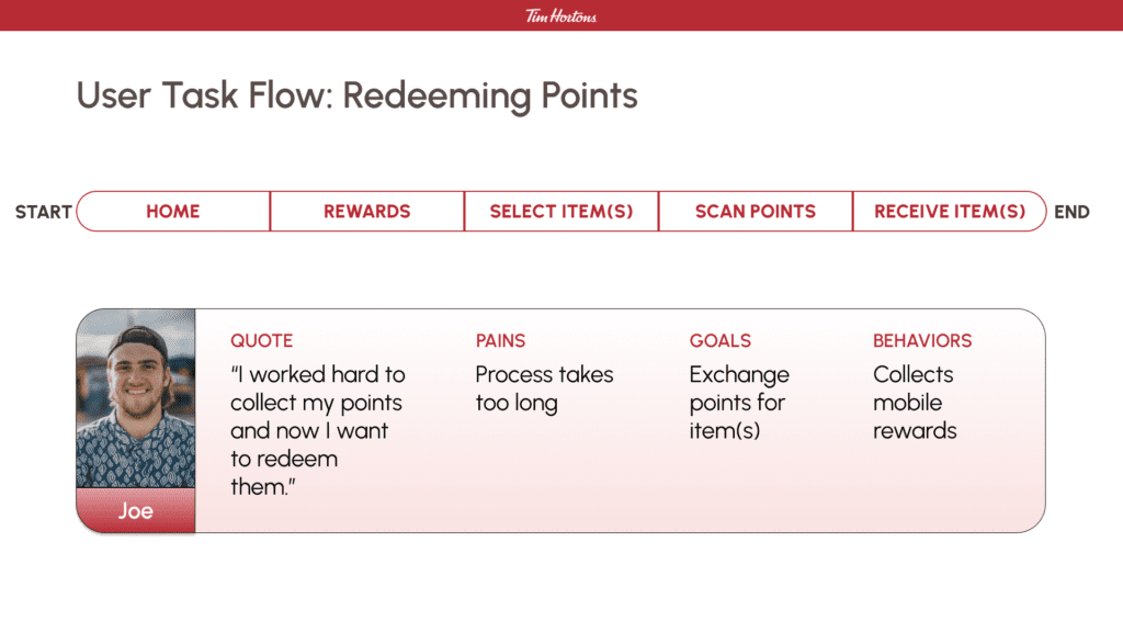
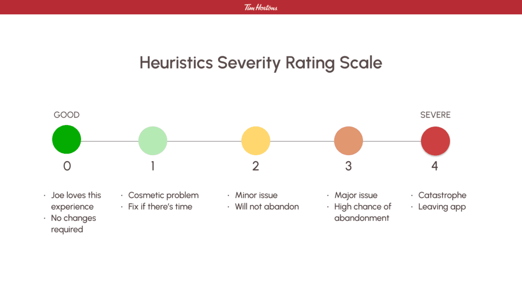
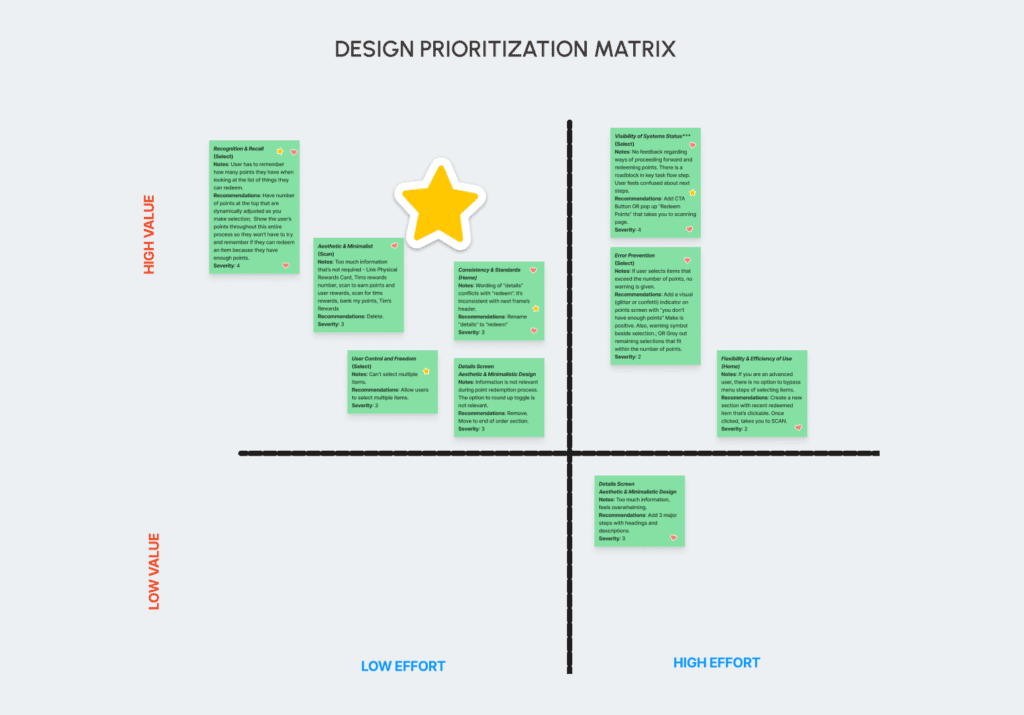
Our team applied the heuristic evaluation to the Tim Horton’s app. We found seven heuristic issues and prioritized three that had the greatest impact on the user’s experience using efficient design solutions. Our approach was through the lens of a returning user looking to redeem their rewards.
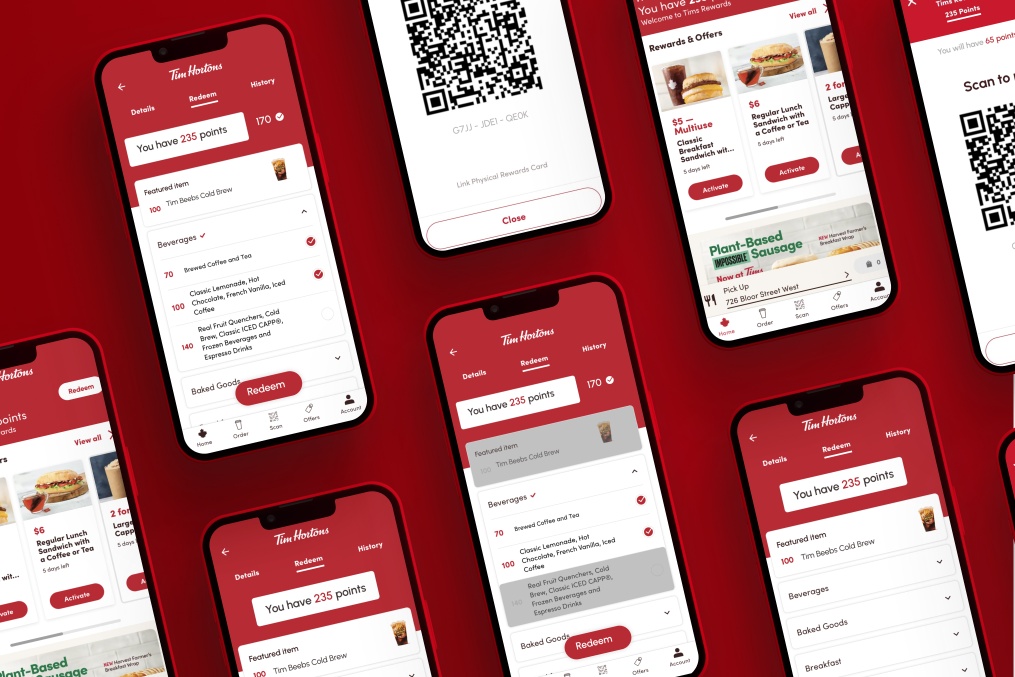
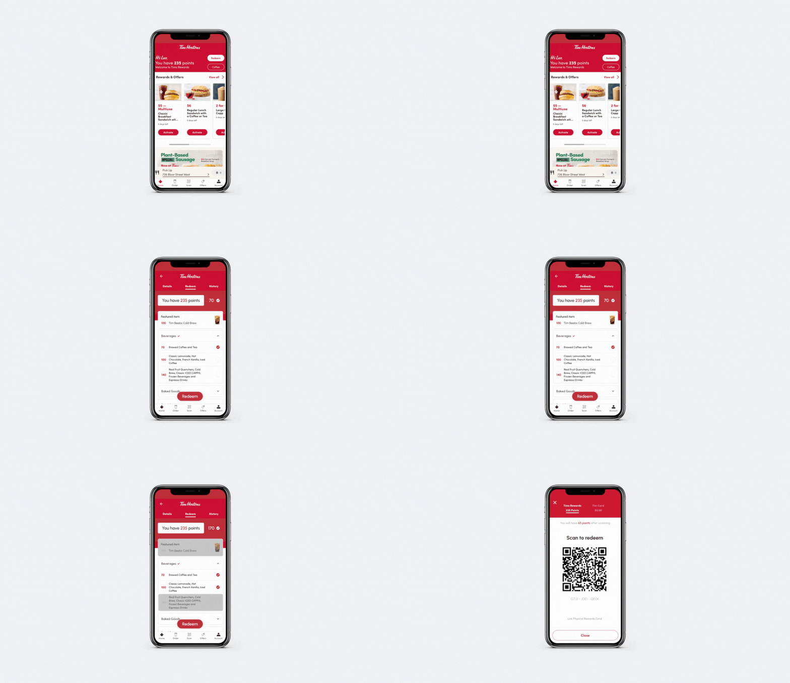
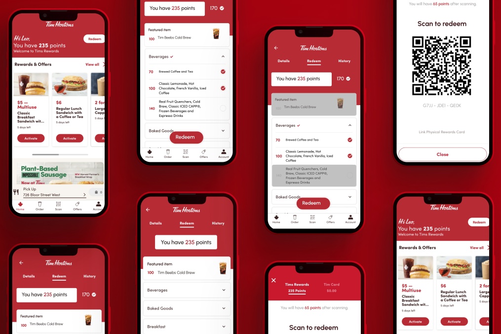
The most impactful heuristic was Consistency & Standards on the Homepage. We discovered that the header, which states to redeem awards, left the user confused as there was no action to take. To resolve this issue, we recommend deleting the “details” button text and replacing it with a “redeem” instead. This will eliminate confusion and frustration of the user and lead them seamlessly to the next screen.
The second most impactful heuristic is Recognition and Recall on the Details page. Here, we noticed that in attempting to redeem rewards, the amount of points are missing. Our recommendation is to have the points visible on the header to avoid the frustration of recalling that information.
The third most impactful heuristic was Visibility of Systems Status also on the Details page. We found that after selecting an item to redeem, there was no next step provided, leaving the user at a dead end. To rectify this confusion and frustration, we propose a call to action button to lead the user to scan and complete their task.
Overall, our team prioritized heuristics and solutions that would provide the user with the most value and feasible design effort.


